• Skip to primary navigation
  • Skip to main content
TAD Graphics logo

t ad studio | tad graphics

A vibrant, multi-disciplinary advertising, communications, creative and digital agency

  • About us
  • What we do
    • Creative and graphic design
    • Copywriting
    • Marketing and advertising
    • Promotional photography
    • Web design and digital media
  • Portfolio
  • Blog
  • Contact us
  • Shop prints

logo

Psychological marketing concepts that actually influence buyer behaviour

16 March 2026 by tadgraphics

Psychological marketing concepts that actually influence buyer behaviour

We like to think we buy with logic. But more often than not, it’s our feelings calling the shots. From colour psychology to social proof, psychological marketing concepts shape the way we shop, scroll and spend.

It’s not manipulation. It’s smart communication.

These tools don’t just help businesses sell. They help messages connect with the right people in a way that feels intuitive and relevant. If you’ve ever added something to your cart without planning to, you’ve already experienced the power of psychological marketing concepts.

So let’s look at what they are and how to use them responsibly.

What are psychological marketing concepts?

Psychological marketing concepts are grounded in human behaviour and decision‑making. They explore how people think, feel and act, then translate those insights into design and strategy.

Emotional triggers, scarcity, authority, colour, typography and social proof all play a part. When applied with integrity, these principles help build trust, loyalty and recognition.

Rather than using tricks, brands that understand psychological marketing concepts communicate with more clarity and empathy. The result is better engagement and stronger customer relationships.

Emotion beats logic

Neuroscientist Antonio Damasio discovered that people with damage to the emotional areas of their brain struggled to make simple decisions, even when they could reason clearly. His research shows that emotion guides choice when logic alone is not enough.

Good marketing reflects that balance. People may justify purchases logically, but emotion drives the decision. Brands that tell genuine stories, use human‑centred imagery and express empathy stay memorable long after a campaign ends.

Emotion builds loyalty, and loyalty drives action.

Shape psychology and visual cues

Shapes carry meaning. Circles feel friendly and inclusive. Squares suggest reliability and order. Triangles create energy and direction. This is shape psychology, a core part of psychological marketing concepts that often works without words.

Rounded buttons invite clicks because they look safe. Sharp corners feel bold and assertive. Even subtle choices in logo design or layout can change how an audience responds.

Designers use these associations to guide attention and evoke emotion before anyone reads a single word.

Colour psychology and perception

Colour affects how we think and feel. Blue creates a sense of calm and trust, which is why banks and health brands rely on it. Red demands attention and can increase urgency. Green represents balance and nature, while yellow brings optimism.

Research shows colour can influence up to 80 percent of product recognition. That’s why brands that understand psychological marketing concepts use consistent colour palettes to build familiarity and emotional connection across every touchpoint.

Scarcity and urgency

When something seems limited, we value it more. This instinct dates back to survival behaviour, but it still works today. Phrases like “limited release” or “available until Sunday” create momentum and encourage faster decisions.

Used ethically, scarcity and urgency highlight opportunity rather than fear. They remind people that action matters now, not later. That’s why these remain among the most powerful psychological marketing concepts in e‑commerce and digital campaigns.

Social proof and trust

People trust people. When we see others enjoying a product, it validates our choice. Reviews, testimonials, endorsements and user photos act as reassurance that a brand delivers what it promises.

Adding social proof to websites or ads signals authenticity and builds credibility. It’s one of the simplest psychological marketing concepts to apply, and it instantly reduces uncertainty for potential buyers.

Cognitive fluency and clarity

The easier something is to read or navigate, the more credible it feels. This is called cognitive fluency. Clean typography, logical layouts and familiar patterns help people trust what they see.

If a design feels confusing, we subconsciously doubt its message. Simplicity is not just aesthetic; it’s persuasive. Brands that apply psychological marketing concepts to improve clarity convert better because customers feel comfortable making decisions.

Final thoughts on psychological marketing

Psychological marketing concepts work because they respect how humans think and feel. When you understand emotion, design, colour and behaviour, you can communicate in ways that feel natural and honest.

The team at TAD Graphics are dedicated to employing best practices in graphic, visual, and web design. This ensures that our projects not only look visually stunning but also convey the intended message effectively. For over 15 years, our team in Perth has utilised these principles to create designs that resonate with the target audience.

Reach out to us today and experience how we can enhance your visual communication. If you have other questions we can answer just like this exploration of psychological marketing,don’t miss our other insightful blog entries.

Filed Under: Blog, Graphic design, Web design Tagged With: branding, logo, visual design, website design

Logo vs brand: What’s the difference and why it matters

16 January 2026 by tadgraphics

Logo vs brand: what’s the difference and why it matters

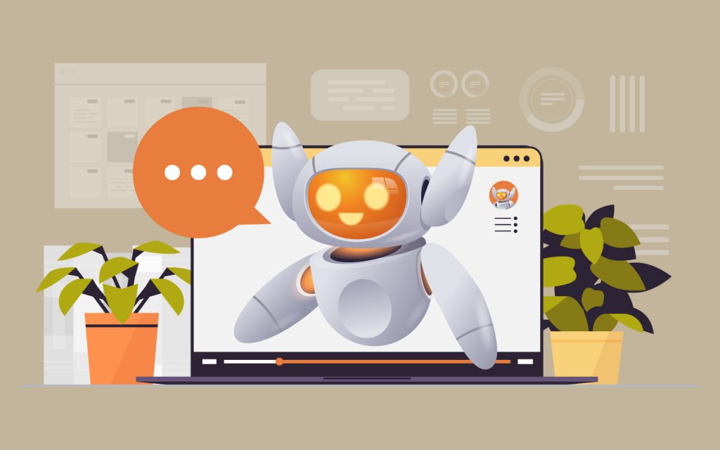
People often say logo when they mean brand, and vice versa. It’s a common mix-up—but one that could seriously limit the way you think about your business identity. So, what’s the real difference in the logo vs brand debate? It’s bigger than you might think.

A logo is a visual symbol. A brand is the entire experience. That’s the short version. But when you dig deeper, you’ll see why confusing the two can lead to weak messaging, poor consistency, and a forgettable presence. If you want your business to be memorable, trustworthy, and instantly recognisable, you need to get clear on logo vs brand and how they work together.

What is a logo, really?

Your logo is the graphic shortcut people use to recognise your business. It’s often a combination of type, colour, and symbol. Think of the golden arches. The Nike swoosh. The Vegemite diamond. These logos don’t explain everything about the product, but they spark instant recognition.

That’s the role of a logo. It’s a visual identifier. But by itself, it doesn’t tell your full story. It’s part of your brand, but it’s not the brand. The logo vs brand conversation starts here: one is a tool, the other is the experience people associate with it.

So what exactly is a brand?

Your brand is everything people feel and remember when they interact with your business. It includes your values, your tone of voice, your design, your packaging, your staff, your customer service—even your scent, if you’ve got one.

It’s not what you say about yourself. It’s what people say about you when you’re not in the room. And it all comes from being intentional about the message you send and how you show up consistently. That’s where logo vs brand becomes a practical design and strategy decision, not just a vocabulary one.

How they work together

A logo without a brand behind it is just decoration. And a brand without a logo has no anchor point. You need both, and they need to work as a team. The logo should reflect your brand’s personality, while the brand brings context, meaning, and feeling to that simple mark.

For example, CHANEL’s logo is just two Cs. But thanks to years of consistent branding, we associate those Cs with luxury, elegance, and French fashion heritage. That’s the logo vs brand difference in action.

Why it matters

When people mistake logo vs brand, they risk building a hollow presence. They get a beautiful logo designed, but their messaging, packaging, socials, and in-store experience all say different things. That inconsistency confuses audiences and dilutes impact.

On the other hand, brands that align their logo with a well-thought-out identity build trust and loyalty. They’re recognisable even without the logo. You could remove the Apple symbol, and you’d still know an Apple store when you walked in. That’s branding. That’s strategy.

Final thoughts on logo vs brand

The team at TAD Graphics are dedicated to employing best practices in graphic, visual, and web design. This ensures that our projects not only look visually stunning but also convey the intended message effectively. For over 15 years, our team in Perth has utilised these principles to create designs that resonate with the target audience.

We don’t just design logos. We help you build a cohesive visual identity that supports your brand in every detail. Because clarity leads to connection – and connection leads to customers.

Reach out to us today and experience how we can enhance your visual communication. If you have other questions we can answer just like this exploration of logo vs brand,don’t miss our other insightful blog entries.
Filed Under: Blog, Graphic design, Web design Tagged With: branding, logo, visual design, website design

Shape psychology: the design trick that speaks louder than words

2 November 2025 by tadgraphics

Shape psychology: the design trick that speaks louder than words

Shapes aren’t just visual decoration. They speak to us on a subconscious level. A square feels solid. A circle feels safe. A triangle feels like it’s going somewhere. That’s the power of shape psychology—and it’s something every designer should be using with intention.

Whether you’re designing a brand identity, a website layout, or packaging for a product, the shapes you choose help shape how people feel. They support your message, build emotional connections, and influence how your work is interpreted. It’s a design strategy that requires no words.

The quiet power of geometric shapes

Let’s start with what most people recognise first: squares and rectangles. These are the dependable workhorses of design. They feel grounded, balanced, and familiar. You’ll see them used everywhere—business cards, social media grids, website headers—because they help create order and trust. They work well for brands that want to be seen as reliable and professional.

Now consider circles. With no hard edges or distinct start and end points, circles offer a sense of softness, warmth, and unity. Designers often use them in logos to suggest completeness or community. Their approachable quality makes them a good fit for health, wellness, and people-focused brands.

Triangles bring a completely different energy. Upright triangles feel stable and strong. Point them sideways, and they suddenly feel dynamic, as if movement is about to happen. If you flip them upside-down, they can even create tension or unease. Triangles are great for guiding attention. You’ll often see them used like arrows, pointing a viewer toward the most important detail in a layout.

Natural, organic and abstract

Not everything must be neat and geometric. Organic shapes—such as leaves, waves, or cloud-like forms—add softness, creativity, and a sense of connection to nature. They are commonly used in eco-conscious branding, wellness spaces, and packaging where a handcrafted feel is highly valued. Since they don’t follow strict rules, organic shapes make designs feel more personal and expressive.

On the other hand, abstract shapes offer a different approach. These can be simplified symbols or forms that don’t directly represent real-world objects, but still suggest emotions, ideas, or movement. Designers use them in logos to convey concepts such as energy, innovation, or progress. Abstract shapes act as visual metaphors, conveying complex messages quickly and adding a modern, creative twist.

Shapes that support your message

Design isn’t just about looking good. It’s about communicating clearly. Shapes help do that, but only when used with purpose. If you want your brand to feel strong and dependable, squares and rectangles are a good choice. If you’re trying to express creativity or growth, something more fluid might be a better fit.

Final thoughts on shape psychology

The team at TAD Graphics are dedicated to employing best practices in graphic, visual, and web design. This ensures that our projects not only look visually stunning but also convey the intended message effectively. For over 15 years, our team in Perth has utilised these principles to create designs that resonate with the target audience.

We don’t just pick shapes because they look good—we choose them because they feel right for your message, your audience, and your brand. And when you get that right, the impact is anything but subtle.

Reach out to us today and experience how we can enhance your visual communication. If you have other questions, we can answer just like this exploration of shape psychology, don’t miss our other insightful blog entries.
Filed Under: Blog, Graphic design, Web design Tagged With: branding, logo, visual design, website design

The 6 styles of animated videos and when to use them

21 September 2022 by tadgraphics

The 6 styles of animated videos and when to use them

Animation is the process of making flat images come alive through the idea of movement. It is a broad concept and includes everything from a one-second GIF to a full-length feature film.

The history of animation extends far beyond animated kids’ movies. The first recorded animator was Pygmalion from Greek and Roman mythology, responsible for creating a figure of the perfect woman whom he begged Venus to bring to life. Animation is known for its mystical and whimsical aesthetic, which aligns its connection to childhood themes. Like folktales, animation can explore emotions and stories in a unique way compared with human actor productions.

While blockbuster movies made using 3D animation align with our conceptual understanding of animation, there are many distinct types. Today, businesses and individuals are using animation to educate, inform, persuade and challenge society through advertising, editorial and informational videos. While the highest quality 3D animation video is usually associated with Pixar films or big brands with extensive marketing budgets, animation is now more readily accessible through the proliferation of software, and the upskilling of professional animators.

Creating an animated video can be fun and engaging for potential customers, or as a project to show your skill. Animation is a compelling way to tell a story, creating a narrative which draws in viewers.

The six types of animation

2D animation

2D animation is flat and driven by graphics or imagery. Traditionally it is called ‘hand-drawn animation’ – a classic representation where the animator captures drawings frame-by-frame in a flat, two-dimensional space, which combines motion with flat or static graphics to create movement.

2D animation is best for conveying complex ideas and concepts, such as B2B marketing content, in which it can simplify communication concepts, taking the content beyond text, but limiting the expense of 3D animation. In 2D animation, there are many ways to use graphics such as photos, illustrations and PowerPoint decks.

Explainer videos often use whiteboard animation for showing customers how to use their website or products. Whiteboard animation is an accessible way to introduce animation into your business, through low-cost tools you can use yourself or by hiring a professional. Creating a video that looks like a whiteboard is a fantastic way to highlight your products or services.

3D animation

3D animation is sometimes known as computer-generated imagery (CGI) which we know from our favourite animated movies and TV shows. There are five sub-categories:

  • Isometric or axonometric – meaning 3D but without perspective, is common in technical illustrations as they are clear, simple, and quick. Best for adding detail to interconnected objects or within considerable environments.
  • Conceptual – useful for abstract products or environments. Best for developing a visually stunning showcase of product, process, or service.
  • Photorealistic – an artistic interpretation of an object or environment, life-like in quality. Best for showing human anatomy, space, or underground layers the naked human eye cannot see.
  • Low poly – minimum number of details or a small number of polygons to express the shape of an object. Best for inexpensive projects where speed is crucial.
  • Looping graphics – animation endlessly replays through joined sequences. Best for bringing an image to life, concepts, time, or humour.

Stop-motion animation

Stop-motion animation is a popular form of animation as it employs similar techniques to traditional animation by joining images through small movements. This type of animation uses real objects, such as characters made from clay, paper or other materials including Lego or puppets. Capturing images one frame at a time, stop-motion animation tends to feel quirky and unusual and allows a significant depth of imagination. It is a tangible form of animation which gives creators a physical object to manipulate within a story.

Motion graphics animation

Motion graphics are varied, as they may use 2D or 3D animation, and typically animate text, logos or video clips. This type of animation is all digital, creating an engaging video through a sense of motion. Motion graphics are popular for explainer videos through their minimal and conceptual style and feature in commercial advertising on TV, news and sports segments and film title sequences.

Kinetic text animation

Animating quotes or text central to the video’s message often employs kinetic text animation. In this type of animation, components of the text interact to encourage the viewer to watch and act. Kinetic text animation works well for strong copywriting and less serious messages.

Augmented reality animation

Augmented Reality (AR) animation is a more recent form of creating alternative ways to interact with content. Similarly, to CGI, AR animation duplicates an object within the viewer’s actual surroundings. This type of animation is best known in video games or experiences including Pokémon GO.

How do 2D and 3D animation compare to each other?

2D animators typically have exceptional skills in drawing and illustration as their imagery is crucial to creating the sense of movement in the animation. 3D animators have stronger technology skills, necessary for understanding how to animate a character or scene. Both 2D and 3D animators need to understand how to create a powerful story. In 3D animation, characters rotate vertically and horizontally, thus requiring greater development of the character’s design, as opposed to a 2D character seen from one direction only.

Let’s chat

Whether you require a 2D or 3D animated video created for web, online learning or marketing we are here to help. Find out more about our web design and digital media services or contact us.

Filed Under: Animation and video, Blog, Graphic design, Web design Tagged With: 2D animation, 3D animation, animation, design, graphic, logo, video

Why you should trust a professional for creating your logo?

28 March 2022 by tadgraphics

Why you should trust a professional for creating your logo?

When you hear Mcdonald’s, what image comes to mind? Is it the yellow or gold uppercase “M” with the words McDonald’s written across it? Now, that’s the power of a logo. This is why big brands spend millions of dollars to design one. Having a good logo is a part of branding. It’s what makes people remember your business. After all, it is the first thing that customers see, and it can make or break a company’s image.

For start-ups or SMEs, it is easy to make the mistake of having an amateur do their logo. After all, hiring an amateur (or even doing the logo themselves) can cut back the cost. But if you want a professional-looking logo, you should hire a professional graphic designer to do it.

But first, we should address this question.

What is a professional logo?

A logo is a professional symbol that represents a business or brand. It is an essential part of a company’s branding and marketing efforts. This helps customers identify the business and its products or services.

A graphic designer or branding agency can create a professional logo that is unique and memorable to promote a company. But a logo made by an amateur is typically created by someone who is not a professional designer. An amateur logo may be adequate for some businesses. But it is not as effective as a professional one in promoting the company and its products or services.

Anyone can design a simple logo. But if you want your company to be taken seriously, you need a logo that meets the standards. Otherwise, you risk looking amateur-ish or, even worse, confused. This is because a professional logo is designed by a designer who obeys fundamental design principles. They also consider the brand identity the business is aiming for. For instance, minor elements such as shape must align with the brand identity a brand is gunning for. Hence, the shape and color used on a logo go a long way in determining the customers’ perception of the brand.

A professional logo will also give your business a competitive edge, which will help get your business out there.

Features of a professional logo

Here are some of the features of a professional logo.

1. Timeless

A professional logo is timeless and never goes out of style. If you have a logo done by a professional, you won’t worry about following the trend or changing your logo every once in a while. It’s because your logo will already speak for your brand. Once you hire a professional graphic designer, they will provide you with a design that you can use for a long time.

2. Simple and memorable

A professional logo is simple and easy to remember. It should be unique enough to stand out, but not so complex that it’s difficult to recall. A graphic designer who has worked with different clients for years knows what can hook your potential customers. Having a professionally done logo ensures that it will be memorable, but straightforward to everyone.

3. Scalable

A  professional logo can be scaled up or down without losing its quality. This is important because you’ll need to use your logo for different contexts, products, and marketing materials. This ensures that the logo looks good on any medium, from a small business card to a giant billboard. Additionally, a scalable logo can be used for print and digital media, which is essential in today’s world where so many people use traditional and electronic formats.

4. Reflective of the company’s values

A professional logo is something that the company can be proud of and stand behind. So, a professional graphic designer must grasp the organisation’s aspirations, mission, and values before designing a logo. Otherwise, the design will be just another combination of lines and colors, with no bearing on the organisation. It should also convey the brand concept from the very first glance.

5. Visually appealing

For people to remember a logo, it must be visually appealing. So, you must avoid cluttered designs or too many colors as this can make the logo difficult to understand. It’s also essential to use colors that work together and complement each other. But this is one of the problems you will face if an amateur makes your logo.

Hiring a professional graphic designer will ensure that your logo looks pleasing. As a result, you can rest assured that your logo looks good and will attract more customers.

6. Emotionally triggering

A good logo should evoke some emotion in the viewer. Whether it’s happiness, trust or excitement, a positive emotion will make people more likely to do business with you. Likewise, a professional logo should leave a positive impression on potential customers. A good logo can help make a business successful and a bad logo can sink a company. That’s why it’s important to put thought into your logo and make sure it’s the best.

A professional designer knows how to make emotionally triggering logos, which is something amateurs would struggle to do. With their years of experience in the industry, you will get a logo that will evoke emotion in anyone who sees it.

7. Versatile

A professional logo can be used in various ways and on different platforms. It should look just as good on a website as it does on a business card or billboard. A professional logo should also be simple enough to reproduce in various sizes. When a logo is too complicated, it often has to be simplified when printed on smaller items like business cards or flyers. This can make the logo lose its original impact.

A professional graphic designer knows this problem. Hence, they will be able to make a versatile logo design that can be used on any platform without losing its original impact.

8. Unique

The logo should also be unique to the company and not copied from other top-rated businesses, or else it would not be legally protected due to plagiarism. Hiring a professional graphic designer will ensure that your logo is unique and not copied from somewhere else.

Why do you need a professional logo?

A logo plays a huge role in dictating brand perception. Get it wrong and your business will come crashing down. So, what are the benefits of a professional logo? Here are some.

You have just one chance to impress

Your logo is often the first thing people will see when encountering your brand. For most customers, their decision to do or not do business with you depends on it. Besides, they decide whether you are reliable enough to do business within a third of a second.

If your logo doesn’t impress customers and fails to project professionalism within that period, you will lose business opportunities. Hence, having a professional logo will help bring more business opportunities.

Whether it’s on your website, social media profile or business card, you want to ensure that your logo gives off the right impression. So, your logo must have the correct fonts, colors and elements. Hiring a professional designer will help lessen your worries about this matter.

Builds credibility

Having a professional logo also builds credibility. Customers know an untrustworthy brand by simply looking at its logo. When people see that you have taken the time and effort to create a professional looking logo, they will be more likely to trust you and do business with you.

This can be an essential factor when competing against other businesses. Having a professional logo shows that you’re willing to put in the extra effort to make your company look good. It will also give you an advantage against your competitors.

Creates brand recognition

One of the main benefits of having a professional logo is that it can create brand recognition. As people see your logo more and more, they will remember your brand and what you stand for. This can be highly beneficial in terms of marketing and reaching new customers. It’s an excellent strategy for remaining relevant in your customers’ minds until they finally decide to patronise you.

Hiring a professional designer to do your logo will ensure that your logo has a unique design that will make it remarkable.

Professional logos are unique

Nod your head if you’ve come across template-heavy graphic design tools. You probably have heard that they’re cheaper than professional graphic designers. They may come cheap and make graphic design more accessible, but as you know, cheap does not equate to quality.

Such tools can never replicate the strategy, creativity and quality you will get from hiring a professional graphic designer. Furthermore, you can’t claim ownership of any logo designed with such templates. So, it’s better to spend on a professional graphic designer who will do the work they are meant to do. You can also claim ownership of the logo after it’s done.

Ultra-targeted

There’s a familiar maxim in marketing: if you’re selling to everyone, you’re selling to no one. It’s the same thing about a professional logo.

Professional logos are a product of in-depth research into the prospective audience that the organisation seeks to resonate with. So, your organisation should attract your ideal audience. These are the people who are more likely to become your customers and even lifetime ambassadors.

Adaptable to various media

For a business in the 21st century, you must be active on different social media platforms and traditional media. Traditional outlets, such as print and television, printers, and creative agencies, are strict about file formats, layouts and colors when submitting logos.

To adhere to these rules, you can either create an alternate version of your logo every time or you can invest in a responsive, adaptable professional logo that you can use across various mediums without distorting its resolution.

The first solution makes you look unprofessional, but the second solution depicts professionalism that will benefit your business.

The bottom line

Professional logos are a must have for any business. Every customer expects to see it and it goes a long way in determining the success of your business. In most cases, it’s what your customers will remember you for. If your logo is unique, visually pleasing and memorable, it will live in their minds rent-free!

Although it costs a lot in the short term, investing in a professional logo is a worthwhile decision and will reap returns in the long run.

Let’s chat

We work with clients of all sizes, from small business owners to not-for-profit organisations. No job is too small! Take a look at some of the logos we’ve created for our clients.

If you would like to know more about our branding, graphic or web design services, please do not hesitate to contact us. We are more than willing to help you.

Filed Under: Blog, Graphic design, Portfolio Tagged With: branding, design, graphic, logo

© Copyright 2005-26. All rights reserved. t ad studio | tad graphics. Web and graphic design Perth. Admin