• Skip to primary navigation
  • Skip to main content
TAD Graphics logo

t ad studio | tad graphics

A vibrant, multi-disciplinary advertising, communications, creative and digital agency

  • About us
  • What we do
    • Creative and graphic design
    • Copywriting
    • Marketing and advertising
    • Promotional photography
    • Web design and digital media
  • Portfolio
  • Blog
  • Contact us
  • Shop prints

Blog

Psychological marketing concepts that actually influence buyer behaviour

16 March 2026 by tadgraphics

Psychological marketing concepts that actually influence buyer behaviour

We like to think we buy with logic. But more often than not, it’s our feelings calling the shots. From colour psychology to social proof, psychological marketing concepts shape the way we shop, scroll and spend.

It’s not manipulation. It’s smart communication.

These tools don’t just help businesses sell. They help messages connect with the right people in a way that feels intuitive and relevant. If you’ve ever added something to your cart without planning to, you’ve already experienced the power of psychological marketing concepts.

So let’s look at what they are and how to use them responsibly.

What are psychological marketing concepts?

Psychological marketing concepts are grounded in human behaviour and decision‑making. They explore how people think, feel and act, then translate those insights into design and strategy.

Emotional triggers, scarcity, authority, colour, typography and social proof all play a part. When applied with integrity, these principles help build trust, loyalty and recognition.

Rather than using tricks, brands that understand psychological marketing concepts communicate with more clarity and empathy. The result is better engagement and stronger customer relationships.

Emotion beats logic

Neuroscientist Antonio Damasio discovered that people with damage to the emotional areas of their brain struggled to make simple decisions, even when they could reason clearly. His research shows that emotion guides choice when logic alone is not enough.

Good marketing reflects that balance. People may justify purchases logically, but emotion drives the decision. Brands that tell genuine stories, use human‑centred imagery and express empathy stay memorable long after a campaign ends.

Emotion builds loyalty, and loyalty drives action.

Shape psychology and visual cues

Shapes carry meaning. Circles feel friendly and inclusive. Squares suggest reliability and order. Triangles create energy and direction. This is shape psychology, a core part of psychological marketing concepts that often works without words.

Rounded buttons invite clicks because they look safe. Sharp corners feel bold and assertive. Even subtle choices in logo design or layout can change how an audience responds.

Designers use these associations to guide attention and evoke emotion before anyone reads a single word.

Colour psychology and perception

Colour affects how we think and feel. Blue creates a sense of calm and trust, which is why banks and health brands rely on it. Red demands attention and can increase urgency. Green represents balance and nature, while yellow brings optimism.

Research shows colour can influence up to 80 percent of product recognition. That’s why brands that understand psychological marketing concepts use consistent colour palettes to build familiarity and emotional connection across every touchpoint.

Scarcity and urgency

When something seems limited, we value it more. This instinct dates back to survival behaviour, but it still works today. Phrases like “limited release” or “available until Sunday” create momentum and encourage faster decisions.

Used ethically, scarcity and urgency highlight opportunity rather than fear. They remind people that action matters now, not later. That’s why these remain among the most powerful psychological marketing concepts in e‑commerce and digital campaigns.

Social proof and trust

People trust people. When we see others enjoying a product, it validates our choice. Reviews, testimonials, endorsements and user photos act as reassurance that a brand delivers what it promises.

Adding social proof to websites or ads signals authenticity and builds credibility. It’s one of the simplest psychological marketing concepts to apply, and it instantly reduces uncertainty for potential buyers.

Cognitive fluency and clarity

The easier something is to read or navigate, the more credible it feels. This is called cognitive fluency. Clean typography, logical layouts and familiar patterns help people trust what they see.

If a design feels confusing, we subconsciously doubt its message. Simplicity is not just aesthetic; it’s persuasive. Brands that apply psychological marketing concepts to improve clarity convert better because customers feel comfortable making decisions.

Final thoughts on psychological marketing

Psychological marketing concepts work because they respect how humans think and feel. When you understand emotion, design, colour and behaviour, you can communicate in ways that feel natural and honest.

The team at TAD Graphics are dedicated to employing best practices in graphic, visual, and web design. This ensures that our projects not only look visually stunning but also convey the intended message effectively. For over 15 years, our team in Perth has utilised these principles to create designs that resonate with the target audience.

Reach out to us today and experience how we can enhance your visual communication. If you have other questions we can answer just like this exploration of psychological marketing,don’t miss our other insightful blog entries.
Filed Under: Blog, Graphic design, Web design Tagged With: branding, logo, visual design, website design

Logo vs brand: What’s the difference and why it matters

16 January 2026 by tadgraphics

Logo vs brand: what’s the difference and why it matters

People often say logo when they mean brand, and vice versa. It’s a common mix-up—but one that could seriously limit the way you think about your business identity. So, what’s the real difference in the logo vs brand debate? It’s bigger than you might think.

A logo is a visual symbol. A brand is the entire experience. That’s the short version. But when you dig deeper, you’ll see why confusing the two can lead to weak messaging, poor consistency, and a forgettable presence. If you want your business to be memorable, trustworthy, and instantly recognisable, you need to get clear on logo vs brand and how they work together.

What is a logo, really?

Your logo is the graphic shortcut people use to recognise your business. It’s often a combination of type, colour, and symbol. Think of the golden arches. The Nike swoosh. The Vegemite diamond. These logos don’t explain everything about the product, but they spark instant recognition.

That’s the role of a logo. It’s a visual identifier. But by itself, it doesn’t tell your full story. It’s part of your brand, but it’s not the brand. The logo vs brand conversation starts here: one is a tool, the other is the experience people associate with it.

So what exactly is a brand?

Your brand is everything people feel and remember when they interact with your business. It includes your values, your tone of voice, your design, your packaging, your staff, your customer service—even your scent, if you’ve got one.

It’s not what you say about yourself. It’s what people say about you when you’re not in the room. And it all comes from being intentional about the message you send and how you show up consistently. That’s where logo vs brand becomes a practical design and strategy decision, not just a vocabulary one.

How they work together

A logo without a brand behind it is just decoration. And a brand without a logo has no anchor point. You need both, and they need to work as a team. The logo should reflect your brand’s personality, while the brand brings context, meaning, and feeling to that simple mark.

For example, CHANEL’s logo is just two Cs. But thanks to years of consistent branding, we associate those Cs with luxury, elegance, and French fashion heritage. That’s the logo vs brand difference in action.

Why it matters

When people mistake logo vs brand, they risk building a hollow presence. They get a beautiful logo designed, but their messaging, packaging, socials, and in-store experience all say different things. That inconsistency confuses audiences and dilutes impact.

On the other hand, brands that align their logo with a well-thought-out identity build trust and loyalty. They’re recognisable even without the logo. You could remove the Apple symbol, and you’d still know an Apple store when you walked in. That’s branding. That’s strategy.

Final thoughts on logo vs brand

The team at TAD Graphics are dedicated to employing best practices in graphic, visual, and web design. This ensures that our projects not only look visually stunning but also convey the intended message effectively. For over 15 years, our team in Perth has utilised these principles to create designs that resonate with the target audience.

We don’t just design logos. We help you build a cohesive visual identity that supports your brand in every detail. Because clarity leads to connection – and connection leads to customers.

Reach out to us today and experience how we can enhance your visual communication. If you have other questions we can answer just like this exploration of logo vs brand,don’t miss our other insightful blog entries.
Filed Under: Blog, Graphic design, Web design Tagged With: branding, logo, visual design, website design

Shape psychology: the design trick that speaks louder than words

2 November 2025 by tadgraphics

Shape psychology: the design trick that speaks louder than words

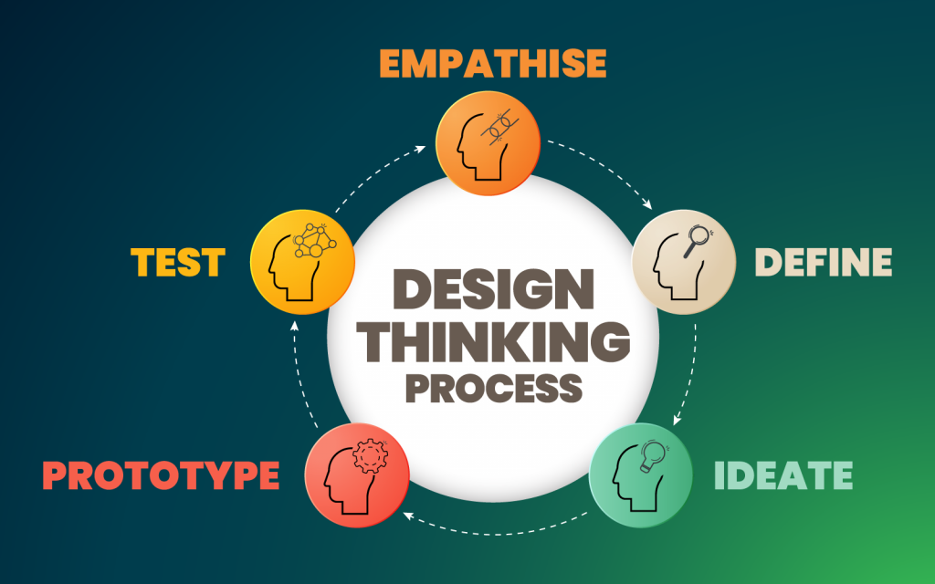
Shapes aren’t just visual decoration. They speak to us on a subconscious level. A square feels solid. A circle feels safe. A triangle feels like it’s going somewhere. That’s the power of shape psychology—and it’s something every designer should be using with intention.

Whether you’re designing a brand identity, a website layout, or packaging for a product, the shapes you choose help shape how people feel. They support your message, build emotional connections, and influence how your work is interpreted. It’s a design strategy that requires no words.

The quiet power of geometric shapes

Let’s start with what most people recognise first: squares and rectangles. These are the dependable workhorses of design. They feel grounded, balanced, and familiar. You’ll see them used everywhere—business cards, social media grids, website headers—because they help create order and trust. They work well for brands that want to be seen as reliable and professional.

Now consider circles. With no hard edges or distinct start and end points, circles offer a sense of softness, warmth, and unity. Designers often use them in logos to suggest completeness or community. Their approachable quality makes them a good fit for health, wellness, and people-focused brands.

Triangles bring a completely different energy. Upright triangles feel stable and strong. Point them sideways, and they suddenly feel dynamic, as if movement is about to happen. If you flip them upside-down, they can even create tension or unease. Triangles are great for guiding attention. You’ll often see them used like arrows, pointing a viewer toward the most important detail in a layout.

Natural, organic and abstract

Not everything must be neat and geometric. Organic shapes—such as leaves, waves, or cloud-like forms—add softness, creativity, and a sense of connection to nature. They are commonly used in eco-conscious branding, wellness spaces, and packaging where a handcrafted feel is highly valued. Since they don’t follow strict rules, organic shapes make designs feel more personal and expressive.

On the other hand, abstract shapes offer a different approach. These can be simplified symbols or forms that don’t directly represent real-world objects, but still suggest emotions, ideas, or movement. Designers use them in logos to convey concepts such as energy, innovation, or progress. Abstract shapes act as visual metaphors, conveying complex messages quickly and adding a modern, creative twist.

Shapes that support your message

Design isn’t just about looking good. It’s about communicating clearly. Shapes help do that, but only when used with purpose. If you want your brand to feel strong and dependable, squares and rectangles are a good choice. If you’re trying to express creativity or growth, something more fluid might be a better fit.

Final thoughts on shape psychology

The team at TAD Graphics are dedicated to employing best practices in graphic, visual, and web design. This ensures that our projects not only look visually stunning but also convey the intended message effectively. For over 15 years, our team in Perth has utilised these principles to create designs that resonate with the target audience.

We don’t just pick shapes because they look good—we choose them because they feel right for your message, your audience, and your brand. And when you get that right, the impact is anything but subtle.

Reach out to us today and experience how we can enhance your visual communication. If you have other questions, we can answer just like this exploration of shape psychology, don’t miss our other insightful blog entries.
Filed Under: Blog, Graphic design, Web design Tagged With: branding, logo, visual design, website design

Five killer font pairings for your brand

4 August 2025 by tadgraphics

5 killer font pairings for your brand

Good design doesn’t shout. It speaks clearly. And your choice of font pairings? That’s one of the loudest voices in the room.

Whether you’re putting together a website, a resume, or packaging for a product launch, the right font pairing instantly sets the tone. It shows who you are before you say a word. A well-chosen combo can build trust, create impact, and guide the eye exactly where you want it to go. And the best part? You don’t need a design degree to get it right — you just need to understand how fonts work together.

Let’s look at five font pairings that not only look great, but work hard for your brand. These combinations strike the balance between visual appeal and function — easy to read, on-brand, and versatile across multiple formats.

1. Funky header + clean body text

Use for: event flyers, posters, landing pages

This combo’s all about contrast. A bold, character-filled header draws attention fast — especially when you’re promoting something exciting. Then a clean, sans serif font steps in to deliver the message without fuss.

Try this pairing

Header: Funkydori, Glodok or Birra
Body: Open Sans, Raleway or Roboto

The funky font gives personality. The clean font keeps things readable. Together, they help people quickly scan the info they need — date, time, location — and remember it.

2. Stylish header + crisp text

Use for: social media ads, promo banners, product announcements

You’ve got milliseconds to stop someone scrolling. A stylish, high-impact header font gets eyes on the ad. But once you’ve caught them, the crisp supporting text needs to do the heavy lifting.

Try this pairing

Header: Bungee, Embryo or Gurkner
Body: Lato, Elza or Articulat CF

This combo works because it builds visual hierarchy. Big, bold up top. Clean and clear down below. And it still looks great on both desktop and mobile.

3. Bold + modern

Use for: corporate comms, portfolios, presentation decks

You want impact, but you also want polish. This pairing is professional without being plain. Bold fonts command attention, while modern fonts give you that fresh, current feel.

Try this pairing

Bold: Oswald, Greycliff or Archivo Black
Modern: Source Sans Pro, Bebas Neue or Kallisto

It’s great for internal updates, investor materials or branding docs where clarity and style both matter.

4. Heavy header + clean text

Use for: resumes, CVs, project proposals

Think of this one as your go-to for showing off experience. A heavier font up top helps key info stand out — job title, section headings, contact info. Then a clean, simple font lets your achievements do the talking.

Try this pairing

Header: Depot New, Bely or Odile
Body: Open Sans, Acumin or Source Sans

It helps guide the reader’s eye exactly where you want it. Bonus? It prints well and still looks great as a PDF.

5. Geometric + friendly

Use for: brochures, business cards, service info packs

This combo is clear, warm and welcoming — ideal for people-first brands or services. A geometric font in your headings brings structure. A friendly font in the body keeps things approachable.

Try this pairing

Header: Noka, JAF Domus Titling or Dazzle Unicase
Body: Gimlet, Chaparral or Montserrat

Together, they feel both modern and trustworthy. Especially helpful when you’re working with a lot of info in a small space.

Final thoughts on font pairings

The right font pairing doesn’t just look good — it shapes how people feel about your brand. From bold headers that grab attention to elegant duos that whisper sophistication, fonts help carry your message before a single sentence is read.

So whether you’re designing a business card, a social ad, or a full campaign — take a moment to consider the tone you want to set. Start with contrast. Think about clarity. And don’t be afraid to experiment with combinations that feel fresh but still fit the mood. Because when the fonts work, your message works harder.

The team at TAD Graphics are dedicated to employing best practices in graphic, visual, and web design. This ensures that our projects not only look visually stunning but also convey the intended message effectively. For over 15 years, our team in Perth has utilised these principles to create designs that resonate with the target audience.

Reach out to us today and experience how we can enhance your visual communication. If you have other questions we can answer just like this exploration of font pairings,don’t miss our other insightful blog entries.

Filed Under: Blog, Graphic design, Web design Tagged With: best practice, font pairing, visual design, website design

A guide to effective page layout design

1 June 2025 by tadgraphics

A guide to effective page layout design

You’ve got a great story to tell — but if the page layout is off, readers won’t stick around to hear it. According to Adobe, 38% of users stop engaging with a site if the layout is unattractive. That’s almost 4 in 10 people gone before they’ve even read the first paragraph.

The good news? A well-designed layout can do more than just look good. It can improve how long people stay on your site, how well they understand your content, and how likely they are to take action.

Whether you’re building a landing page, writing a blog post, or designing a guide, this is your practical breakdown of how to layout content that works — for your readers and for your brand.

Why layout affects how people read

When someone lands on your page, their eyes start scanning. Not reading, scanning.

Research from Nielsen Norman Group shows that most people don’t read a web page word-for-word. They scan in patterns — like the classic F-shape — looking for headlines, keywords, and anything that visually pops.

That means layout isn’t just about aesthetics. It’s about helping your readers find the value fast. Smart layouts guide the eye, highlight the most important points, and remove distractions.

Done right, it can reduce bounce rates, increase time on page, and even lower support queries — because people actually find what they’re looking for.

Start with the right width

If your text stretches too wide across the screen, it’s hard to read. If it’s too narrow, it becomes choppy and awkward.

Aim for 66 to 75 characters per line. That’s the sweet spot for readability.

It gives enough space for a full thought, without making your reader’s eyes do too much work. Bonus: it also makes your content easier to scan for F-pattern readers.

Break up your content into logical sections

Think of your page like a conversation. People want to know where it starts, where it’s going, and what to expect next.

Use clear subheadings. Keep paragraphs short. Add space between sections. Use design elements like dividers, pull quotes, or side notes to help guide the flow.

Even something as simple as listing out your main points at the top of a guide (with anchor links) can improve comprehension and navigation.

Use visual hierarchy to guide attention

Make the most important stuff big and bold. Use consistent heading sizes. Body copy should be readable — nothing smaller than 16px.

Hierarchy isn’t just about font size either. It’s about contrast, spacing, and how elements relate to each other on the page.

A good layout naturally tells the reader what to look at first, what matters most, and where to go next. It’s like storytelling through design.

Help people navigate long pages

If your content is over 3,000 words (think ultimate guides or pillar pages), always include a table of contents at the top. Use anchor links so people can jump to the section they care about.

You can also add sticky elements that stay visible as the person scrolls — like a floating menu or persistent sidebar — to keep navigation simple.

It’s especially helpful for people who are coming in with a clear question and just want to get to the answer quickly.

Add emphasis in smart, subtle ways

Your most important information shouldn’t get lost in a sea of text.

Pull it out with visual cues. Use bold text, colour changes, or icons to draw attention to stats or key messages. Sidebars, callouts, or even small illustrations can help make important info stand out — and stay memorable.

Just don’t go overboard. Too much noise and nothing stands out.

Use margins and side content wisely

Margins aren’t dead space — they’re prime real estate for extra value. Think tips, definitions, quotes, or related links.

This keeps the core content clean, while still giving more to those who want it. It’s also a nice way to cater to both scanners and detail-seekers without overwhelming either.

Check everything on mobile

Before you hit publish, preview your layout on mobile. Always.

Your layout needs to collapse cleanly, keep headings clear, and ensure nothing important gets buried or cut off.

Test everything – Your call-to-action buttons, text alignment, and navigation elements on small screens to name a few. If it’s hard to read or clunky to use, tweak it before your readers bounce.

Final thoughts on page layout

You don’t need flashy animations or custom code to build a strong page layout. What you do need is a structure that works with how people read — not against it.

Keep things readable. Use hierarchy. Guide the eye. Make navigation easy. And always, always consider how your page feels on a phone.

The team at TAD Graphics are dedicated to employing best practices in graphic, visual, and web design. This ensures that our projects not only look visually stunning but also convey the intended message effectively. For over 15 years, our team in Perth has utilised these principles to create designs that resonate with the target audience.

Reach out to us today and experience how we can enhance your visual communication. If you have other questions we can answer just like this exploration of page layout,don’t miss our other insightful blog entries.

Filed Under: Blog, Graphic design, Web design Tagged With: best practice, layout design, visual design, website design

Layout design: Why it’s the key to visual appeal

5 May 2025 by tadgraphics

Layout design: Why it's the key to visual appeal

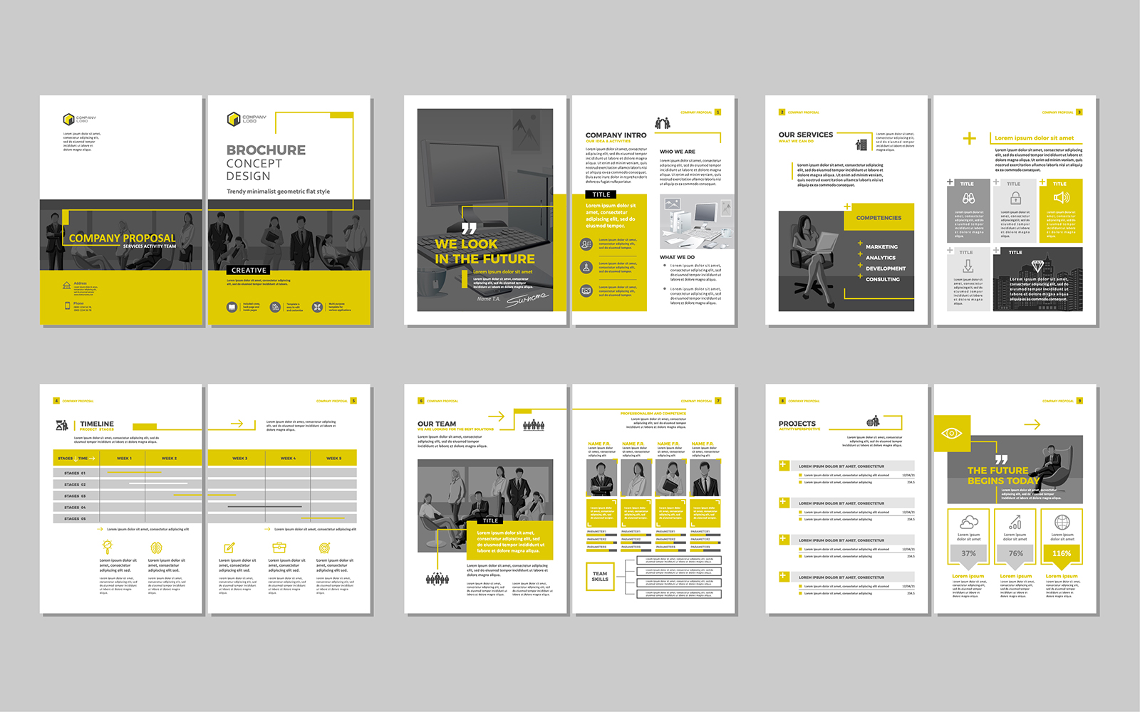
A well-designed layout isn’t just about how something looks. It’s how the message gets across. The layout sets the tone, shows readers what to focus on, and helps them move through information naturally. Without it, even great content can end up feeling clunky or confusing.

It enhances readability and comprehension

Great layout helps people absorb information faster. A clear structure with headings, subheadings, short paragraphs, and white space makes even dense content easier to scan. It lets people jump straight to what matters most to them without feeling lost in a wall of text.

It establishes visual hierarchy

Not everything carries equal weight. Visual hierarchy—things like font size, contrast, and spacing—helps guide the reader’s attention. The big headline grabs attention, subheadings keep things organised, and smaller text fills in the details. Done well, it lets your design speak before someone even reads a word.

It creates balance and harmony

Balanced layouts feel polished and professional. That doesn’t always mean symmetrical—sometimes asymmetry works better—but every element needs to feel like it belongs. Good balance builds trust and keeps people engaged longer.

It strengthens brand consistency

Consistent layout choices help your brand look cohesive. Whether it’s on a website, social post, flyer, or brochure, people should instantly recognise your content. That means using the same grid, spacing rules, and font hierarchies across the board. A consistent structure tells your audience you know what you’re doing.

It works across different formats

Layouts need to adapt. What looks good on a poster might not work on a mobile screen. Responsive layout design means your message gets through no matter how or where someone’s looking at it. Thinking about the layout early makes it easier to stay flexible without losing impact.

Final thoughts on layout design

A thoughtful layout brings structure, clarity, and visual flow to any design. It turns content into communication. Whether you’re designing for web, print, or anything in between, prioritising layout makes your work more effective—and more enjoyable to read. It’s the difference between content that just looks good and content that actually works.

The team at TAD Graphics are dedicated to employing best practices in graphic, visual, and web design. This ensures that our projects not only look visually stunning but also convey the intended message effectively. For over 15 years, our team in Perth has utilised these principles to create designs that resonate with the target audience.

Reach out to us today and experience how we can enhance your visual communication. If you have other questions we can answer just like this exploration of layout design,don’t miss our other insightful blog entries.
Filed Under: Blog, Graphic design, Web design Tagged With: best practice, layout design, visual design, website design

  • Page 1
  • Page 2
  • Page 3
  • Interim pages omitted …
  • Page 18
  • Go to Next Page »

© Copyright 2005-26. All rights reserved. t ad studio | tad graphics. Web and graphic design Perth. Admin