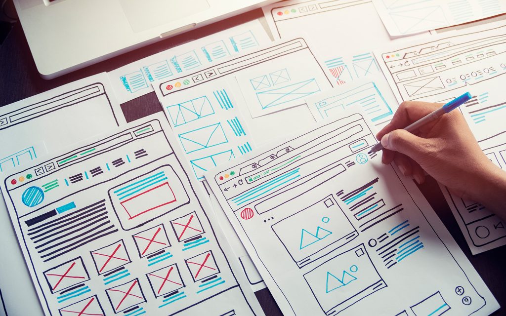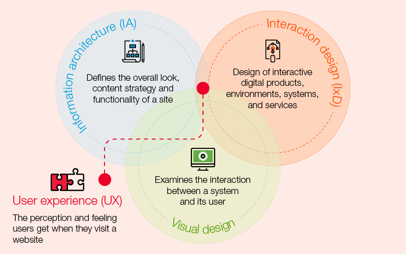
Web design is a multifaceted discipline that requires attention to detail and a deep understanding of user experience. To create engaging and effective websites, designers must adhere to best practices that enhance functionality, aesthetics, and accessibility.
Come along as we explore the key principles of web design that contribute to a successful online presence.
Consistency is king
Consistency is a cornerstone of effective web design. By maintaining consistent branding elements, layout styles, and navigation across all pages, designers create a cohesive user experience. Consistency helps users navigate the website with ease and builds trust and credibility.
Responsive design is essential
In today’s digital landscape, responsive design is non-negotiable. Websites must be optimised for various devices, including desktops, laptops, tablets, and smartphones. Responsive design ensures that content is accessible and visually appealing regardless of the screen size, improving user engagement and satisfaction.
Accessibility matters
Web accessibility is crucial for ensuring that all users, including those with disabilities, can access and navigate the website effectively. Designers should follow accessibility standards such as using alt text for images, providing keyboard navigation options, and ensuring colour contrast for readability.
The need for speed
In a fast-paced online environment, website speed can make or break user experience. Optimising loading times, minimising unnecessary elements, and leveraging caching techniques are essential for delivering a smooth and speedy browsing experience. Fast-loading websites not only satisfy users but also improve search engine rankings.
Clear call-to-action
Effective web design includes clear and compelling calls-to-action (CTAs) that guide users towards desired actions. Whether it’s making a purchase, signing up for a newsletter, or contacting the business, CTAs should be prominently displayed, visually distinct, and accompanied by persuasive copy that encourages the audience to engage further with your brand.
Content is king
High-quality content plays a central role in engaging visitors and driving conversions. Designers should prioritise content readability, relevance, and organisation. Incorporating visual elements such as images, videos, and infographics enhances the overall user experience and communicates information effectively.
Security is non-negotiable
In an era of increasing cyber threats, it’s no secret that website security should be the paramount priority. Implementing SSL certificates, regular security audits and robust data protection measures instil trust and confidence in users. A secure website protects sensitive information and preserves the brand’s reputation.
Final thoughts on web design
Adhering to best practices in web design is essential for creating user-friendly, visually appealing, and secure websites. By prioritising the principles outlined above, designers can deliver exceptional experiences that delight users and achieve business objectives.
The team at TAD Graphics are dedicated to employing best practices in graphic, visual, and web design. This ensures that our projects not only look visually stunning but also convey the intended message effectively. For over 15 years, our team in Perth has utilised these principles to create designs that resonate with the target audience.
Reach out to us today and experience how we can enhance your visual communication. If you have other questions we can answer just like this exploration of web design principles and best practices,don’t miss our other insightful blog entries.


