
• Skip to primary navigation
  • Skip to main content
TAD Graphics logo

t ad studio | tad graphics

A vibrant, multi-disciplinary advertising, communications, creative and digital agency

  • About us
  • What we do
    • Creative and graphic design
    • Copywriting
    • Marketing and advertising
    • Promotional photography
    • Web design and digital media
  • Portfolio
  • Blog
  • Contact us
  • Shop prints

visual hierarchy

Why typography matters

5 December 2024 by tadgraphics

Why typography matters

Typography isn’t just about choosing a font that looks nice — it’s about creating an experience. Whether you’re designing a website, crafting a presentation, or building a brand, the way you arrange text can make or break your message. Studies show that people form a first impression of a design in just 50 milliseconds. That means the fonts, spacing, and hierarchy you choose aren’t just aesthetic — they’re critical.

Think about it: would you trust your life savings to a bank with Comic Sans in its branding? Or read a long report in tiny, squished text? Typography shapes how people feel, react, and engage with your content. Let’s break down how the right choices can enhance readability, convey emotions, and strengthen your brand’s impact.

What is typography?

Typography is the art and technique of arranging text in a way that’s visually appealing and easy to read. It involves several key elements, including:

  • typeface and font selection
  • font size and colour
  • line length and spacing
  • alignment and hierarchy

Typeface vs. font: what’s the difference?

A typeface is a family of fonts (e.g., Arial), while a font is a specific style within that family (e.g., Arial Bold). The typeface you choose should align with your brand’s personality. Here’s a quick breakdown:

  • Serif fonts (e.g. Times New Roman): Formal and traditional
  • Sans-serif fonts (e.g. Arial): Modern and clean
  • Script fonts (e.g. Brush Script): Elegant and personal
  • Display fonts (e.g. Impact): Bold and attention-grabbing

The psychology of fonts

Fonts speak so much louder than you think. A Sans-serif font might communicate professionalism, while a playful script can evoke creativity. Ensure your font choices align with the tone of your content.

If your business is in finance, a playful script font might send mixed signals. However, pairing fonts from different families—like a Serif for headings and a Sans-serif for body text—can create a balanced, polished look.

Read more about Font psychology: Here’s what you need to know.

Font size and colour: striking the right balance

Font size matters more than you might expect. While it’s tempting to use small text to fit more content, larger fonts are easier to read and improve user experience.

  • Body text: Aim for 14–16px for screens
  • Headings: Use 18px or larger

Line length and spacing: keep it comfortable

The way your text flows across a page impacts how easily readers absorb information. Short lines can feel choppy, while overly long ones are hard to follow.

  • Optimal line length: 50–75 characters per line for desktops, 30–40 for mobile devices
  • Line spacing: Use 1.5x to 2x the font size to keep content easy on the eyes

Visual hierarchy: guiding the reader’s journey

Most people scan content rather than reading word for word. A strong visual hierarchy ensures they see the most important information first.

  • Use larger, bold fonts for headings
  • Apply subheadings to organise content
  • Highlight key phrases with colour or weight

Why typography matters: Final thoughts

Typography isn’t just about making your text look good—it’s about building trust. Consistency in fonts, spacing, and design across all your platforms creates a cohesive brand image. Whether it’s your website, social media, or printed materials, using the same typography rules makes your brand recognisable and professional.

We’re dedicated to employing best practices in graphic, visual, and web design. For over 15 years, our team in Perth has utilised these principles to create designs that resonate with the target audience.

Reach out to us today and experience how we can enhance your visual communication. If you have other questions we can answer just like this exploration of why typography matters, don’t miss our other insightful blog entries.

Filed Under: Blog, Graphic design, Web design Tagged With: best practice, font, typography, UI design, visual design, visual hierarchy, website design

Web design best practices for beginners

25 September 2024 by tadgraphics

Web design best practices for beginners

Web design is a multifaceted discipline that requires attention to detail and a deep understanding of user experience. To create engaging and effective websites, designers must adhere to best practices that enhance functionality, aesthetics, and accessibility.

Come along as we explore the key principles of web design that contribute to a successful online presence.

Consistency is king

Consistency is a cornerstone of effective web design. By maintaining consistent branding elements, layout styles, and navigation across all pages, designers create a cohesive user experience. Consistency helps users navigate the website with ease and builds trust and credibility.

Responsive design is essential

In today’s digital landscape, responsive design is non-negotiable. Websites must be optimised for various devices, including desktops, laptops, tablets, and smartphones. Responsive design ensures that content is accessible and visually appealing regardless of the screen size, improving user engagement and satisfaction.

Accessibility matters

Web accessibility is crucial for ensuring that all users, including those with disabilities, can access and navigate the website effectively. Designers should follow accessibility standards such as using alt text for images, providing keyboard navigation options, and ensuring colour contrast for readability.

The need for speed

In a fast-paced online environment, website speed can make or break user experience. Optimising loading times, minimising unnecessary elements, and leveraging caching techniques are essential for delivering a smooth and speedy browsing experience. Fast-loading websites not only satisfy users but also improve search engine rankings.

Clear call-to-action

Effective web design includes clear and compelling calls-to-action (CTAs) that guide users towards desired actions. Whether it’s making a purchase, signing up for a newsletter, or contacting the business, CTAs should be prominently displayed, visually distinct, and accompanied by persuasive copy that encourages the audience to engage further with your brand.

Content is king

High-quality content plays a central role in engaging visitors and driving conversions. Designers should prioritise content readability, relevance, and organisation. Incorporating visual elements such as images, videos, and infographics enhances the overall user experience and communicates information effectively.

Security is non-negotiable

In an era of increasing cyber threats, it’s no secret that website security should be the paramount priority. Implementing SSL certificates, regular security audits and robust data protection measures instil trust and confidence in users. A secure website protects sensitive information and preserves the brand’s reputation.

Final thoughts on web design

Adhering to best practices in web design is essential for creating user-friendly, visually appealing, and secure websites. By prioritising the principles outlined above, designers can deliver exceptional experiences that delight users and achieve business objectives.

The team at TAD Graphics are dedicated to employing best practices in graphic, visual, and web design. This ensures that our projects not only look visually stunning but also convey the intended message effectively. For over 15 years, our team in Perth has utilised these principles to create designs that resonate with the target audience.

Reach out to us today and experience how we can enhance your visual communication. If you have other questions we can answer just like this exploration of web design principles and best practices,don’t miss our other insightful blog entries.

Filed Under: Blog, Web design Tagged With: best practice, UI design, visual design, visual hierarchy, website design

The principles and best practices of visual design

16 July 2024 by tadgraphics

The principles and best practices of visual design

In today’s digital age, mastering the art of visual design is crucial for effective communication. Whether you’re a seasoned designer or a newcomer to the world of visuals, understanding and applying these principles can elevate your designs to new heights.

Join us as we dive into visual design principles and best practices and uncover the strategies that can transform your creative projects.

Visual design principles and best practices

Here are some of the visual design principles and best practices that we’d recommend acquainting yourself with if you’re looking to become an expert.

Prioritise legibility

Legible text is essential for effective communication. Ensure that your text contrasts well with the background to improve readability. Pay attention to font size, spacing, and alignment to make your text easy on the eyes.

Simplicity is key

Designing with simplicity in mind is crucial. Avoid overloading your designs with unnecessary elements. Keep it clean, straightforward, and free of distractions to effectively communicate your message.

Embrace white space

Don’t be afraid of empty space in your designs. Utilise white space strategically to enhance readability and focus. It helps guide the viewer’s attention to the most important elements of your design.

Choose colours wisely

Selecting the right colours can significantly impact the effectiveness of your design. Stick to a limited colour palette of 2-4 colours to maintain cohesion and visual appeal. Ensure that the colours you choose complement each other harmoniously.

Consistency is paramount

Maintaining consistency across your designs creates a cohesive and professional look. Keep fonts, colours, and styles consistent to establish a recognisable brand identity and improve user experience

Use icons effectively

Icons are powerful tools for visual communication. Incorporate icons to convey information quickly and enhance understanding. They add visual interest and aid in organising content effectively.

Prioritise user experience

Always consider the end-user when designing. Focus on creating designs that are intuitive, accessible, and user-friendly to ensure a positive experience for your audience.

Understand spacing and alignment

Proper spacing and alignment contribute to a balanced and visually pleasing design. Use grids and guidelines to align elements accurately and maintain a sense of harmony in your layout.

Incorporate stock images thoughtfully

Choose high-quality stock images that align with your message and resonate with your audience. Avoid clichéd or outdated images that detract from your design’s impact.

Experiment with dotted lines

Dotted lines can be used creatively to illustrate connections and relationships in your designs. They are effective for visualising workflows, processes, and concepts in an engaging way.

Keep text concise

Aim for brevity in your text content. Use clear and concise language to convey your message effectively without overwhelming the viewer with unnecessary information.

Seek feedback and iterate

Don’t hesitate to seek feedback from peers and stakeholders. Iterate your designs based on constructive feedback to continuously improve and refine your visual communication.

Utilise design tools efficiently

Take advantage of design tools and software to streamline your workflow and create professional designs. Familiarise yourself with the features and capabilities of these tools to enhance your design process.

Mindful font usage

Choose fonts carefully to ensure readability and visual appeal. Limit yourself to 1-2 fonts and maintain consistency in font sizes throughout your design. Opt for fonts that align with your brand and project a modern image.

Final thoughts on visual design principles

Our commitment to employing visual design principles and best practices ensures that each of our projects not only looks visually stunning but also conveys the intended message effectively. For over 15 years, our team in Perth has utilised these principles to create designs that resonate with the target audience.

Reach out to us today and experience how we can enhance your visual communication. If you have other questions we can answer just like this exploration of visual design principles and best practices, don’t miss our other insightful blog entries.
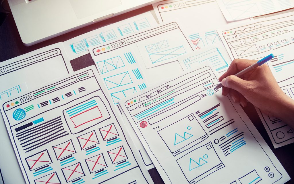
Filed Under: Blog, Graphic design, Web design Tagged With: graphic design, UI design, visual design, visual hierarchy

Visual design vs graphic design: What’s the difference?

24 May 2024 by tadgraphics

Visual design vs graphic design: What’s the difference?

Welcome to our guide on visual design vs graphic design! In this exploration, we’ll decode the differences between these two essential pillars of creativity. Whether you’re a design pro or just starting, this journey promises clarity and inspiration. Let’s dive in and see what it’s all about.

Visual design vs graphic design: the breakdown

Visual designers tend to specialise in digital experiences, expertly blending user interface (UI) and user experience (UX) design principles to create engaging digital platforms.

On the other hand, graphic designers understand how to use visual elements like shapes, colours, and typography to communicate messages in an impactful way across various mediums, including print and digital.

What does a visual designer do?

Visual designers enhance digital experiences by:

  • utilising HTML, CSS, and other programming languages for website and app development
  • developing visual concepts to elevate user experience and align with company objectives
  • collaborating with developers and marketing professionals to launch successful digital initiatives
  • applying user interface design principles to various digital platforms such as video games, e-commerce websites, and mobile apps
  • creating mockups of design projects and presenting them to cross-functional teams
  • enhancing user experience through strategic design element selection for each product
  • establishing fundamental requirements for new user interfaces
  • applying prototyping, wireframing, and other techniques to communicate new concepts effectively
  • ensuring project completion with the necessary functionality.

Is it fun being a graphic designer?

Graphic designers focus on visual communication through print and digital media. They create layouts for magazines, book covers, posters, and advertisements, using tools like Adobe Photoshop and InDesign.

Collaboration, design skills, and an eye for visual aesthetics are key in this role. If these things align with your strengths and interests, you can have a very enjoyable and successful career as a graphic designer.

Skills and qualifications

When it comes to the visual design vs graphic design showdown, they both typically require a degree in graphic design, visual communication, or a related field. Skills in design software, collaboration, and effective communication are essential for success in these roles.

Job opportunities

In terms of career progression, visual designers can explore roles like UX/UI designers and web designers, and graphic designers may advance to positions such as art directors, creative directors, production artists, and animators.

Final thoughts on visual design vs graphic design

In short, graphic designers emphasise visual communication, whereas visual designers prioritise enhancing the overall user experience. Whether you’re drawn to the digital space as a visual designer or prefer the versatile world of graphic design, there’s a wealth of opportunities awaiting your creative talents.

At TAD Graphics, our commitment to aesthetic perfection ensures that our projects not only look visually stunning but also effectively convey the intended message. For over 15 years, our team in Perth has utilised these principles to create designs that resonate with the target audience. Reach out to us today and experience how we can enhance your visual communication. If you found this exploration of visual design vs graphic design valuable, don’t miss our other insightful blog entries.
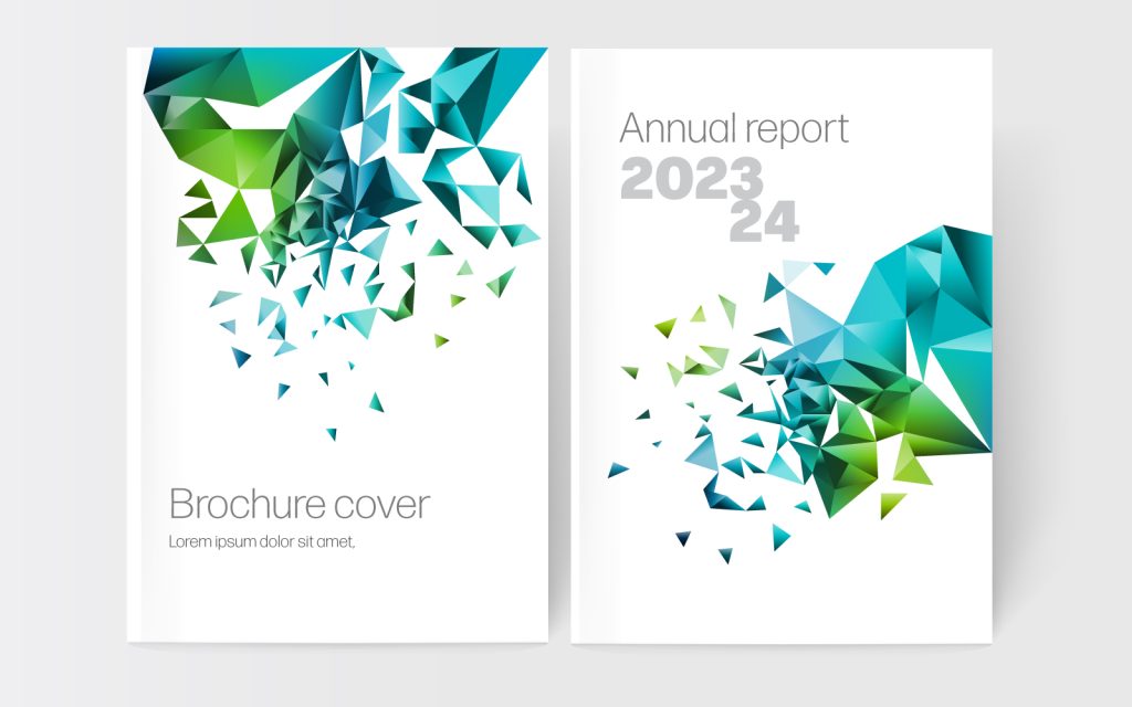
Filed Under: Blog, Graphic design, Web design Tagged With: graphic design, UI design, visual design, visual hierarchy

What is visual design?

20 April 2024 by tadgraphics

So, you’ve found your way here with one burning question on your mind; what is visual design? In a nutshell, it encompasses the art of crafting digital experiences through a thoughtful blend of aesthetics and functionality. It goes far beyond mere aesthetic appeal, into the world of user interaction and experience enhancement.

Come along as we take a comprehensive approach to answering the question, what is visual design?

What is the meaning of visual design?

Visual design is the strategic arrangement of visual elements such as colour, typography, imagery, and layout to convey messages, evoke emotions, and guide users through digital platforms. It aims to create engaging and intuitive user experiences.

Is visual design the same as graphic design?

While visual design and graphic design share many similarities in utilising visual elements, they serve distinct purposes. Visual design focuses on user experience and digital interaction, whereas graphic design encompasses a broader spectrum, including print and digital media communication.

What are the basic concepts of visual design?

Some of the key concepts in visual design include:

  • Using colour to evoke emotions, establish brand identity, and create a visual hierarchy
  • The selection and arrangement of fonts for readability and visual appeal, known as typography
  • Applying visual imagery like illustrations and photography to convey messages and enhance storytelling.
  • Structuring the layout of content and design elements for intuitive navigation and information hierarchy
  • Employing symbols and icons for quick visual communication and interaction cues

What is an example of visual design?

So, now you know the general answer to the question, what is visual design in theoretical terms, it’s time to look at a practical application.

An exemplary instance of visual design can be seen in the user interface of Duolingo, a popular language-learning application. Its vibrant and friendly visual design communicates a welcoming and interactive learning environment, enhancing user engagement and enjoyment.

Why visual design matters?

Visual design is the first impression a product makes, impacting user trust and credibility. It contributes significantly to branding and effective communication of a product’s personality. In addition, consumers often base their judgments on a product’s visual cues, highlighting the importance of visual design in user perception.

When visual design is essential

Visual design is integral throughout the design process, from conceptualisation to completion. It is particularly crucial in the later stages of a project when focusing on pixel-perfect execution and personality design.

Final thoughts on visual design

Well, there you have it. We hope we’ve successfully answered the question, what is visual design? to your satisfaction.

In summary, visual design plays a pivotal role in shaping digital experiences and influencing user perception, engagement, and brand identity. By understanding its principles and leveraging its power, designers can create compelling and user-centric digital solutions.

At TAD Graphics, our dedication to quality ensures that our projects not only look visually stunning but also effectively communicate the intended message. For over 15 years, our team in Perth has utilised these principles to create designs that resonate with the target audience.

Reach out to us today and experience how we can enhance your visual communication. If you have other questions we can answer just like this exploration of ‘what is visual design?’ don’t miss our other insightful blog entries.
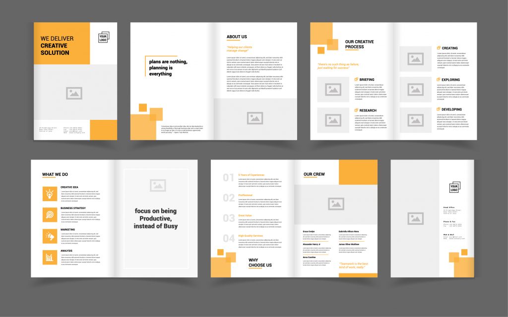
Filed Under: Blog, Graphic design, Web design Tagged With: graphic design, UI design, visual design, visual hierarchy

Less is more: Uncovering the essence of minimalism in graphic design

13 November 2023 by tadgraphics

Minimalism in graphic design

In a world that is positively bursting with endless information, minimalism emerges as a breath of fresh air, embodying the classic saying, less is more. This design philosophy, not only employed but celebrated by TAD Graphics, is not just a trend but an enduring approach that resonates with audiences across the globe.

Come along as we explore the aesthetics of minimalism in graphic design, its effectiveness, and how it can be applied to communicate messages succinctly and elegantly.

What is minimalism in graphic design?

Minimalism is a design ethos that advocates for beauty in simplicity and functionality. It thrives on the idea of reducing the elements of a design to only the essential, stripping away any superfluous details. In graphic design, minimalism is characterised by these key principles:

  • Simplicity is key, with a focus on reducing design elements to the essentials like using a maximum of two fonts and a minimal colour palette
  • Functionality is prioritised, ensuring every design element serves a specific purpose and enhances accessibility
  • Visual hierarchy helps in organising information effectively, directing the viewer’s attention to the focal point
  • Proportions need careful attention as minor imbalances are more noticeable in minimalist designs, grids can help organise elements
  • Simple typefaces are chosen for readability and clarity, with bold, straightforward fonts often preferred
  • Negative space is a fundamental aspect, utilised to highlight the focal points and make the core message stand out

The beauty of minimalism in graphic design

Minimalist designs are often perceived as clean, elegant, and easy to decipher, demonstrating a high level of sophistication with minimal elements. Our portfolio provides a glimpse into the timeless appeal of minimalism, where simplicity and clarity take centre stage.

The effectiveness of minimalism in graphic design stems from several factors:

  • Minimalist designs are easy to read and understand. They communicate your core message without any distractions
  • The simplicity and elegance of minimalist designs often make them more memorable and impactful for your target audience
  • The minimalist approach is versatile, lending itself well to various media and formats with minimal adjustments needed
  • With fewer elements to consider, minimalist designs can be faster and more cost-effective to produce

How to apply minimalism in graphic design

Embracing minimalism in graphic design can be both an art and a science. Here are some key principles to consider:

  • Avoid unnecessary elements; every component in the design should serve a purpose
  • Utilise negative space to create a clean, uncluttered design
  • Opt for simple, legible typography that communicates the message clearly
  • Employ a limited colour palette to create a cohesive and harmonious design
  • Maintain a consistent design approach across different media and formats to build a recognizable brand identity

Final thoughts on minimalism in graphic design

Minimalism transcends a mere design trend; it’s a philosophy that has stood the test of time, continuously appealing to audiences in an ever-evolving digital landscape. The principle of less is more is at the core of minimalism, emphasising simplicity, clarity, and functionality in design.

At TAD Graphics, we embrace minimalism to ensure our projects are not only visually appealing but also effectively communicate the intended message. Since 2005, our Perth-based team of creatives has been harnessing these principles to deliver designs that captivate the target demographic. Contact us today and discover how we can elevate your designs. If you’ve enjoyed this deep dive, be sure to check out our other blog posts.

Filed Under: Blog, Graphic design, Web design Tagged With: graphic design, minimalist, UI design, visual hierarchy

  • Page 1
  • Page 2
  • Go to Next Page »

© Copyright 2005-26. All rights reserved. t ad studio | tad graphics. Web and graphic design Perth. Admin