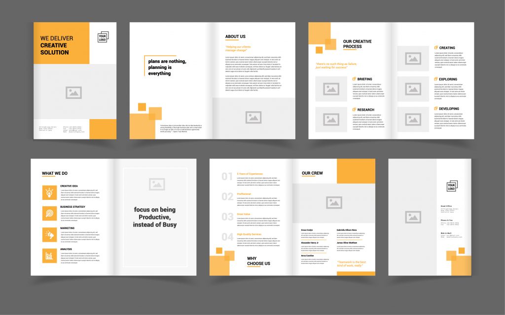
Have you ever wondered why some designs instantly capture your attention and guide your eyes effortlessly, while others are less engaging? This isn’t a coincidence—it’s the result of a carefully crafted visual hierarchy in graphic design.
Come along as we take a deep dive into the world of visual hierarchy and the critical role it plays in graphic design.
What is visual hierarchy?
Visual hierarchy refers to the arrangement and presentation of design elements in a specific way that signifies importance. It’s about utilising visual cues to guide the viewer’s eyes to specific information in a predetermined order.
The visual hierarchy in graphic design allows designers to control the delivery of a message, directing viewers’ attention and enhancing the overall user experience.
Why is visual hierarchy important in design?
Visual hierarchy is crucial in graphic design because it establishes the order in which viewers process information. It allows designers to control the viewer’s journey, emphasising key elements and ensuring the most important information gets noticed first.
By implementing a clear visual hierarchy, a design can convey its message more effectively, making it more intuitive, engaging, and impactful.
What are the 12 principles of design hierarchy?
Visual hierarchy in graphic design is governed by several principles that dictate how elements are perceived in relation to each other. Here are the 12 key principles:
- Larger elements attract attention first
- Bold colours draw the eye, while muted tones recede into the background
- High contrast between elements draws attention and defines the hierarchy
- Elements aligned with each other create a clear path for the eye to follow
- Elements placed close to each other are perceived as related
- The use of negative space emphasises an element by giving it room to “breathe”
- Unique textures or patterns attract attention and indicate higher importance
- Variations in font, size, weight, and spacing significantly impact the hierarchy
- Repeating elements indicate their importance and create rhythm
- Elements in the foreground are perceived as more important than those in the background
- Simplified designs allow for a clearer hierarchy and easier comprehension
- Blurring or sharpening specific elements manipulates the viewer’s focus
What is type hierarchy in design?
Type hierarchy involves the strategic use of font variations to denote importance and guide the viewer’s eyes. Varying font sizes, weights, styles, and spacing are used to distinguish between headings, subheadings, body text, and other text elements. Type hierarchy helps to make text-heavy designs more legible, scannable, and visually engaging.
What is an example of hierarchy in design?
Let’s explore visual hierarchy in graphic design by imagining how a newspaper captures and manages the reader’s attention. It shapes how information is absorbed and understood. Here are the main elements that contribute to a newspaper’s effective visual hierarchy:
Size hierarchy
Large headlines grab attention, followed by smaller subheadings that add context, and the smallest text for detailed content.
Colour and contrast
Used strategically in breakout boxes or quotes to maintain engagement and guide the reader’s eye.
Alignment and proximity
Visual elements, like images or sidebars, align with related articles, aiding navigation
Negative space
Creates focus, improves readability by reducing clutter and gives room for elements to breathe.
Consistency
Achieved through repeating design elements like font, size and line spacing across different articles, creating rhythm and unity.
Foregrounding
Important images or news items are placed in the foreground to signal their importance.
Simplicity
Despite having much information, a well-designed newspaper maintains a clear layout for easy comprehension.
Focus manipulation
Sharpening or blurring specific items subtly guides the reader’s attention across the page.
Crafting attention-worthy designs with TAD Graphics
At TAD Graphics, we understand the power of visual hierarchy in graphic design. Since 2005, our Perth-based team of creative experts has been harnessing these principles to deliver designs that captivate and communicate effectively.
We pride ourselves on creating designs that not only look stunning but also provide a clear, intuitive user journey. Contact us today and discover how we can elevate your designs. If you’ve enjoyed this deep dive into visual hierarchy in graphic design, be sure to check out our other blog posts.
