• Skip to primary navigation
  • Skip to main content
TAD Graphics logo

t ad studio | tad graphics

A vibrant, multi-disciplinary advertising, communications, creative and digital agency

  • About us
  • What we do
    • Creative and graphic design
    • Copywriting
    • Marketing and advertising
    • Promotional photography
    • Web design and digital media
  • Portfolio
  • Blog
  • Contact us
  • Shop prints

web design

The power of negative space: how embracing the empty can enhance your design

23 May 2023 by tadgraphics

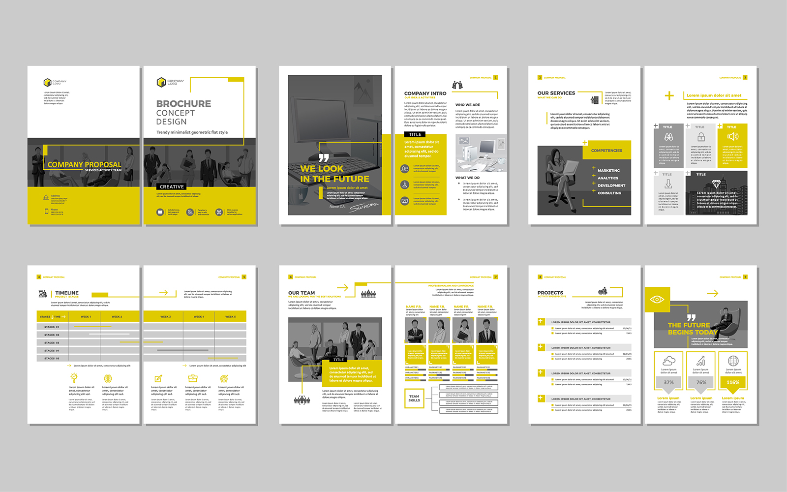
Sample design layout

In the world of graphic design, negative space, or white space as it’s otherwise known, holds a remarkable influence over the effectiveness and impact of a design. Although it may seem counterintuitive, strategically incorporating negative space, can result in visually appealing and impactful designs.

If you’re unsure of how to use negative space in design or why – come with us as we explore the impact it can have on your brand and how you can use it to your advantage.

Understanding negative space

Negative space plays a crucial role in design as it allows the viewer’s eyes to rest, creating a harmonious balance between the various elements. It helps define the boundaries of objects and enhances their visibility. By learning how to use negative space in design effectively, you have the power to evoke emotions, guide the viewer’s attention, and communicate the intended message clearly.

How to use negative space in design

Let’s take a deep dive into the role negative space can play in your imagery.

It highlights the main subject

One of the key aspects of design is knowing how to use negative space effectively. By strategically incorporating empty areas around the main subject, designers can draw attention to it and make it the focal point of the design. This technique enhances the visual impact and communicates the intended message clearly.

It can improve readability

When it comes to text-heavy designs, negative space plays a significant role in enhancing readability. By giving each element, such as typography or imagery sufficient breathing room, designers can improve legibility and comprehension. Properly utilising negative space ensures that the text is easily readable and the message is conveyed effortlessly.

It creates visual balance

Achieving visual balance is crucial in design, and negative space plays a vital role in it. By strategically distributing elements and incorporating empty areas, designers can prevent a design from feeling crowded or overwhelming. Negative space allows the elements to interact harmoniously and creates a visually balanced composition.

It can evoke an emotional response

Understanding how to use negative space in design can evoke specific emotions in the viewer. By intentionally utilising empty space, designers can manipulate perception and create a desired atmosphere.

Whether it’s a minimalist design with ample negative space evoking sophistication or contrasting positive and negative spaces creating energy, utilising negative space effectively allows for powerful emotional responses.

At TAD Graphics, we know how to use negative space in design – and so much more

Whether you’re seeking a captivating website or eye-catching promotional artwork, our comprehensive range of affordable creative solutions and tailored skills are designed to set you apart from the competition.

Since establishing our place on the market in 2005, TAD Graphics has been a vibrant, multi-disciplinary advertising, communications, creative, and digital agency. We take pride in delivering cost-effective graphic and web design solutions for businesses of all sizes – and, yes, we know how to use negative space in design.

Our dynamic team of visionaries is based in our Perth offices and is passionate, attentive, and endlessly creative. We combine our wealth of specialist skills and artistic flair to achieve second-to-none results for your brand.

Contact our friendly team today, and let us show you the difference our creative expertise can make for your business. Together, we can turn your vision into a reality.
Filed Under: Blog, Graphic design, Web design Tagged With: graphic design, readability, web design, white space

Colours and accessibility in web and graphic design

30 April 2017 by tadgraphics

Colours and accessibility in web and graphic design

Colour is a vital feature in web and graphic design. It helps to enhance a website’s aesthetic appeal and convey information. But even more importantly, colour plays a key role in the usability and accessibility of a website. Colour can increase accessibility but when used incorrectly, it can create unnecessary difficulties.

Older people, and those with only partial sight or colour blindness often face difficulties accessing important information, simply because the design of the site or the graphics are not optimised for accessibility.

It is good practice to anticipate the requirements of diverse groups of users. A visual design that accommodates the broadest audience possible is always the best practice in web and graphic design.

The challenge

Designing for those with partial sight or colour deficits, particularly colour blindness, can be challenging. It’s not easy to determine what colours these users can see and how that’s different from people with normal vision.

Colour blind people generally find it hard to distinguish certain colour combinations, which may vary depending on their type of colour blindness. In other words, there are different types of colour blindness and the difference between them is what makes coming up with accessible designs all the more difficult and complex.

Prioritising the design is a good strategy I find works most of the time. The content, and how best to present it, should be the main focus of any design in these circumstances.

When it comes to web page design, fonts, typefaces and colours can actually make some content difficult to read. Therefore, optimising text (font) and colours is the best way to make your design colour-blind safe and friendlier to almost everyone.

Optimising text (font) and colours is the best way to make your design colour-blind safe and friendlier to almost everyone

So, what works best?

Colours and fonts with distinct contrast offer better readability. Therefore, they work best for people with colour blindness and vision deficiency.

It’s important to note that it is the contrast between colours that makes them either more or less discernible and not actually the individual colours themselves. By contrast here I mean the difference between the darkest colour (foreground e.g. text) and the lightest colour (background).

Colour blind people are less sensitive to colours that fall on either side of the spectrum. For instance, red and blue may appear darker to a colour blind user. Such a deficit can be compensated by increasing the contrast between the foreground (text) and background colours.

In other words, if you lighten the background colours and darken the foreground colours in your design, you will make the contrast between them greater, which in turn increases its visual accessibility.

For example, bright and vibrant colours like orange, yellow or white are suitable for the background, and a darker colour such as blue or black for the text.

There is no single best combination to work with and this is mainly due to the different sight conditions. While some users are comfortable with yellow text on a black or blue background, others may prefer black text with a white background.

The Web Content Accessibility Guidelines 2.0 offers a contrast ratio guideline that designers can utilise to ensure accessibility of their website content. The recommended contrast ratio between text and its background is at least 4.5:1. For large text, that is, 24px or 29px bold, this ratio should drop to 3:1.

What about font?

The choice of font is another very significant issue when it comes to web and graphic design accessibility.

A large percentage of users, especially those whose sight is less strong, have trouble reading small fonts, particularly below 14 points. While for some the barrier lies in the low contrast between text and background.

So, what’s the best approach as far as font and font size is concerned?

Light text (white or light yellow) on a dark background (e.g. black) may be more readable for older users or those who are partially sighted than the traditional dark text on a light background.

This might sound contradicting with my earlier recommendation on colour contrasting, but it’s not. The idea is still the same. That is, to attain the highest possible contrast between text and background colours.

For font size, one thing to keep in mind is that the logical resolution between platforms somewhat differ. Nonetheless, it is recommended to use larger font sizes, preferably at least 16 to 18 points.

The same applies to spacing between lines of text. The majority of partially sighted users have difficulty locating where the next line of text begins while reading. So, a good spacing should be around 25 to 30 per cent of the font size.

In addition to line spacing, text that has close letter spacing often presents difficulties for readers with partial sight. So wide monospaced letters might be legible enough for these readers.

Another thing to consider is the font family. Here, it’s ideal to employ only clear, commonly used fonts. Fonts like Standard Serif, Arial or Sans-Serif are the best, since they are quite legible and easier to read than a font like Times New Roman for instance.

Again, there is no best font type or size, it’s just a matter of striking a good balance that will give all users the best possible experience. One thing to avoid though is using absolute font sizes on your design.

Why bother?

You might wonder why web and graphic designs should be optimised for accessibility for such a small population. Well, those with normal vision are not the only online users. Colour blind, partially sighted and older people could make up to 2 in 20 online visitors.

For a regular site, that extra traffic from this group of users might not be that significant, but for an accessible well-designed website, they are worth considering as another good source of visibility.

And there are other benefits than just an increase in traffic too.

A good accessibility design when done well will also help with search engines rankings. Visually impaired people often use screen readers to read content on web sites. These screen readers function in the same manner as text browsers and most search engines rely on text browsers to review how friendly a site is to all users.

By designing an accessible web site, you make it search engine friendly and easier for search engine robots to crawl, which should lead to higher rankings and that’s an added benefit.

A good accessibility design when done well  will also help with search engines rankings

Building a site that’s accessible by everyone is also good practice and both designers as well as developers have a responsibility to ensure that their web and graphic designs take into account all users who wish to view their content.

On top of that, there are standards and guidelines that keeps sites accountable. One of the most crucial web compliance as far as accessibility is concerned is the Web Content Accessibility Guidelines 2.0. It defines a set of accepted international guidelines that web designers and developers should follow to make web content accessible to users with disabilities.

The WCAG has three priority levels in which compliance with the recommendations specified in each level guarantees greater accessibility of web sites. In addition to the three priority levels, there are three levels of conformance that a site must abide to for it to be considered accessible.

All in all, designing inclusively for the widest audience is much more rewarding and should not be taken lightly. It’s important that web and graphic designers realise that you don’t need to compromise the look and feel of a website in order for it to be accessible.

Call + 61 402 636 014 to find out more about our web and graphic design services. You can also get in touch via our contact page, or by sending an email to tadgraphics@t-adstudio.com

Filed Under: Blog, Web design Tagged With: accessibility, contrast, design, graphic design, web, web design

Seven things a website needs to succeed

13 October 2016 by tadgraphics

7 things your website needs to succeed

What do I need to do to make my website a success? It’s a common question we get asked by our clients. Pretty much everyone with a website has their eye on the big prize – getting their business onto page one of Google. In today’s demanding and competitive online space, if you want the best chance of boosting google rankings, increasing traffic and ultimately attracting more customers and sales, you need to make sure you’ve got the key elements covered.

You see, not all websites are made equal. If the essential components aren’t there, your efforts at placing top in Google ranking search results won’t deliver the desired results. Google has lots of different algorithms and tools to determine where websites appear in search engine results. It means you have to fight hard to make yourself stand out. And it starts by following a few simple steps.

So let’s take a look at some of the fundamentals a website needs if it has any chance of succeeding.

Be responsive

40-per-cent-smartphones
Source: The Mobile Story, Neilsen Mobile Ratings, September 2015

We’ve previously blogged in detail about the advantages of responsive websites. With more people than ever before turning to their smartphones and tablets to search the internet, if your website stands any chance of being successful, it must be optimised for mobile devices. If you want to give your customer the best user experience possible and help boost traffic and search engine rankings, a responsive website is a necessity and not a luxury.

Have well written relevant content

Let’s not beat around the bush. Google loves and respects well written, unique and relevant content. High quality search engine optimised content will help you gain more website traffic, strengthen your brand’s online reputation, increase engagement and generate more leads. Creating quality content doesn’t just mean using correct grammar and ensuring the copy isn’t littered with typos. It also means making sure what you write about is readable. The benefits of great website content speak for themselves. So change it. Refresh it. Update it. And never, ever, lift content from another website without permission. Google strongly discourages duplicate content and copying content will come back to bite you on the bum – never mind the fact that it’s just plain wrong!

Make sure your content is optimised for search engines

Your content needs to be well written and engaging; enough so that it grabs the attention of your audience and potential customers. But it must also grab the attention of search engines too. So you need to optimise your content with keywords and phrases. Keyword optimisation is a process which involves incorporating keywords relevant to your business into your text. Keyword research will help to determine the words and phrases people are using when they search the internet for goods and services. When optimising content don’t let readability suffer, so avoid keyword stuffing at all costs. Over-optimisation will ultimately do more harm than good. Relevant keywords should also feature in title tags, meta descriptions and URLs. Don’t forget to optimise the visual elements of your website too, such as photos, with alt text descriptions and image title tags.

Have a blog

Blogs boost website traffic by as much as 55%

So you’ve got great, well written and engaging content. And you’ve made sure to optimise your copy with useful and relevant keywords. Good job! But don’t forget to keep your website updated with fresh content. Regularly updated websites are looked favourably upon by the Google gods. And one of the easiest and most affordable ways to get new content onto your website is by having a blog. Blogs help businesses establish themselves as industry experts and they can boost website traffic too – by as much as 55%. Remember to create content that meets the needs of your target audience. And because most people scan content rather than read it, make it easy for them to read because if you don’t they won’t.

Publish high quality images

with ecommerce websites, 67% of customers rate the quality of a product image as “very important”

It’s often said that images speak louder than words. Good quality high resolution photos are essential because they will help to tell your story and sell your products and/or services. In the case of ecommerce websites, 67% of customers rate the quality of a product image as “very important” when it comes to buying products. Using high quality images can help to increase the quality of user engagement. Not only that, websites featuring poor quality images look unprofessional, less trustworthy and less reputable. Images must also be relevant to your content, otherwise you run the risk of sending conflicting messages.

Contact details on every page

Make sure visitors to your website know how to get in contact with you. Ideally you should have your phone number and email in the footer of every web page. A specific contact page should include these details together with your bricks and mortar address, mailing address (if different), hours of operation (if applicable) and a contact form for customers to get in touch with you. If you’ve got social media profiles like Twitter, Instagram and Facebook, make sure to include these too. Basically the more information the better.

Call to actions

Good call to actions are very important and can improve conversion rates. Call to action buttons are used to direct site visitors and to get them to take a specific course of action. They need to be easy to find and easily identifiable. Use short actionable words and regularly test the placement, size and even colour to see what works best for you.

At TAD Graphics, we offer a range of affordable creative services. We design cost-effective responsive websites for individuals, businesses and organisations who require a professional online presence. We can also assist with various forms of content creation to address marketing needs, including promotional photography, graphic design and copywriting.

Get in touch to discuss your requirements by giving the team a call on +61 402 636 014. You can also send us a message by filling out the form on our contact page or drop an email to tadgraphics@t-adstudio.com

Filed Under: Blog, Web design Tagged With: content, copywriting, mobile responsive, web design, website

Four fabulous reasons why websites need great content

26 August 2016 by tadgraphics

Four fabulous reasons why websites need great content

We often get asked about the benefits of good website content, and why it’s important to use a professional website copywriter. After all, most of us have the ability to write, even if we can’t design an awesome website. As true as that may be, writing unique high-quality search engine optimised content is a completely different kettle of fish.

It pains us to say this, but far too often, website content is an afterthought in website development. Which is not just wrong but pretty foolish. The words on your website will speak volumes about your company: who you are, what you do and your ethos. If your website is poorly written, what does that say about your business? Potential customers will not be impressed.

In order for your website to be the effective marketing tool it’s designed to be, you’ll need more than fancy web design to stand out in the crowded online space. Websites need engaging, well-written and informative copy to succeed. And that’s where a professional copywriter is worth his or her weight in gold. From boosting SEO rankings to gaining more traffic and leads, a skilled professional copywriter will be able to provide customised content to connect with customers.

We give as much attention to what’s written on your website, as we do to the way it looks and responds.

So, let’s look at what well written, engaging and informative website content can do for you.

It will help build your online reputation

Whatever your line of work, your reputation can be the difference between success and failure. To strengthen your brand and stand out in the online space, the words on your website will play a huge role in building your online presence and reputation. With high quality copy, your business will benefit from higher levels of engagement needed to build awareness of your company and brand. Quality customised content goes a long way to establishing authority and trust, positioning credibility as an expert in your industry. If you can establish rapport and trust, people are more likely to buy the goods and services you are selling.

Increase website traffic

Static websites are so yesterday. You may as well not have a website if you don’t keep it updated and populated with fresh new content. Did you know that by having a blog on your website it will increase website traffic? A survey carried out by HubSpot revealed that businesses with a blog get 55% more traffic compared to those that don’t. You can’t argue with those results! With a blog, you have the perfect opportunity to engage with your target audience. Blogs are also great for keeping your website updated with regular relevant and shareable content.

Generate more leads

Great content will help generate leads. Many B2B and B2C businesses recognise the benefits of blogging as part of their content marketing strategy. The higher the quality of the content you produce and share, the more credible your online position, which will help boost engagement and attract leads. According to research conducted by WebDAM, businesses that blog on a regular basis generate 67% more leads each month, compared to businesses who don’t. Again, it’s hard to argue with those statistics.

Help with inbound advertising

Not all advertising is affordable, particularly in the current economy. Many businesses simply don’t have the marketing budget for traditional outbound advertising like radio and TV ads. Inbound advertising is definitely much more affordable. Good quality content will bring potential customers to you and you won’t have to spend the big bucks on old outbound marketing methods, like buying ad space. A blog on a website is a cost-effective form of advertising compared to traditional forms. Aim to publish search-engine friendly high quality content at least once a week – and don’t forget to share what you’ve written across social media too.

At TAD Graphics we don’t just design great websites, we can also help with the content part too! From SEO copy and blogs to email marketing, newsletters and social media marketing, we offer affordable creative copywriting and communication services to help address your content marketing needs.

To discuss your project and get a quote, simply give us a call on +61 402 636 014, send an email to tadgraphics@t-adstudio.com or message us via our contact form.

You can also keep up-to-date with our adventures by following TAD Graphics on Twitter and LinkedIn.

Filed Under: Blog, Web design Tagged With: content, copywriting, web design, website

© Copyright 2005-26. All rights reserved. t ad studio | tad graphics. Web and graphic design Perth. Admin