• Skip to primary navigation
  • Skip to main content
TAD Graphics logo

t ad studio | tad graphics

A vibrant, multi-disciplinary advertising, communications, creative and digital agency

  • About us
  • What we do
    • Creative and graphic design
    • Copywriting
    • Marketing and advertising
    • Promotional photography
    • Web design and digital media
  • Portfolio
  • Blog
  • Contact us
  • Shop prints

web

What makes a good user experience design?

22 April 2018 by tadgraphics

What makes a good user experience design?

In order to come up with a good user experience design, it is important to first understand the meaning of the terms user experience and design. There are several definitions relating to user experience but in simple terms, it refers to the comfort and satisfaction of a person while interacting or using a particular product, application, brand or system (see our previous blog on User experience for web and digital media).

Design on the other hand focuses on the 5 E’s. That is efficiency, effectiveness, ease of use, enjoyability and environmental friendliness of a user’s interaction with a product or service. Therefore, UX design is about making the user’s experience with the product the best as possible.

Features of a good experience design

Designing a good user experience (UX) calls for a number of things that need to be integrated into it. A good user experience design (UXD) is not just about handling the technical issues and functionalities relating to the design; it also involves taking into account the visual appearance, efficiency, and ease of use of the product.

In short, a good user experience design is one that focuses on the value the product provides to its intended end user. With this in mind, below we’ve listed nine key features and attributes that make up a good user experience design.

1. An understanding of your users and their requirements

It is very important to know your audience. This is the starting point to every design project of a good UX. Some questions to ask yourself are who are your target users? What are their needs? What are their ethnical backgrounds? Their gender? What is their main source of income? Their main activity? Their wants and desires. The questions you need to address will vary depending on the kind of design. However, user requirements are the start of any good UXD of a product, brand, application, site, service or system.

2. User navigation pattern

Think of a road map, for example. There is a certain path(s) to be followed to arrive at that destination. Similarly, when coming up with a good UXD you need to study the user’s path in a web page. What areas receive the most visits? What actions do these users perform frequently on that page(s)? What do they search for the most often?

It is measured by what areas a user frequently clicks on when they visit a new site. User flow is then recorded by the way in which a user navigates a site, and this is where you ask yourself some questions as a UX designer. How many levels of navigation does a user willing to go? Do they return to the homepage a lot? Do they tend to use inline links? By understanding what your target users interact with within a website will go a long way in building a user experience that is targeted to them.

3. Aesthetic appeal

Any good UX is rooted in some solid design concepts; it should be attractive to the eye and look nice to your target users. We all think differently hence every designer has the privilege of using different colour palettes and layouts on their interfaces. They need to be well executed, so the designer should apply caution. While not forgetting the interests of your users, something that looks visually appealing to the user’s eye is your reward.

4. Concise

In other words, concise translates to being clear, therefore you should be careful not to fall into the trap of over clarifying. For example in a website, including a lot of descriptions and illustrations about an item, object or entity – not knowing you are adding bulkiness to your interface – will deter your users to read through all your explanations.

The key is to be clear and concise. Wherever you can, stick to explaining a feature in one line instead of two go. Where you can label an object with one word instead of three, then do just that. To achieve a balance on your interface requires times and effort, but when done right you will surely eat the fruits of your success.
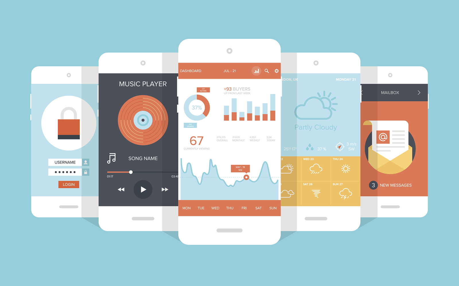
Mobile user experience design

5. Responsive

Responsive can be used to refer to two things in this context. Number one, responsive means the interface you have developed should provide some form of feedback to the users to inform them of what is happening. For example, how would you know you have successfully clicked on a button? The button should display a clicked status, or the button text could change to loading status or play a spinning wheel or even show a progress bar to give some feedback of success to the user.

Responsive could also mean fast. Using sluggish or slow interfaces is disappointing and frustrating to the user, on the other hand reducing page load time improves user experience.

6. Re-considerate (should give another chance)

People are bound to make mistakes. Therefore, offering a way to deal with these errors is a vital aspect in the quality of your product.

A re-considerate interface is one that can save your users from costly mistakes and give them another chance. For example, if a user accidentally deletes some important information can they easily undo that action? Or can they easily retrieve it? You should be able to offer a helpful list of alternatives in such a scenario. Your interface should cover all that for a good UX.

7. Consistency

A good UX design should maintain a certain level of consistency. Your interface should allow users to develop some flow and usage pattern. For example, in Microsoft Word users can learn how the different buttons, icons and tabs function and will also recognise or “memorise” them when they next use the software. They will also be able to operate new features faster by recalling the previous experiences.

8. Add options and shortcuts

Options and shortcuts are a privilege in life that everybody loves to use. When you want to achieve a good UXD these are key to the success of your product, site, or brand.

Implement options and shortcuts upon completion of the page design and layout. For example, adding the search, hide, more or scroll options that are vital to achieving a great UX design.

9. Ask for feedback

This is an important part of the design process. Ask friends or colleagues who are not familiar with the product, application or site to test it out and provide usability feedback. Observing them while they use your product and seeing where they are having difficulties will assist you to achieve the success of your UXD.

The bottom line

Whether it is a website or any sort of graphics, the user’s greatest satisfaction will depend on the usefulness and usability of the product or the value it provides. It will also depend on their experience when interacting with the product, both in terms of performance and vision. Designing a good user experience with a focus on the user should always be the primary goal of your product, system or service.

If you would like to know more about our web design services, please do not hesitate to get in touch.
Filed Under: Blog, Graphic design, Web design Tagged With: design, graphic, interface, user experience, ux, uxd, web

Ten tips for designing infographics

1 March 2018 by tadgraphics

Ten tips for designing infographics

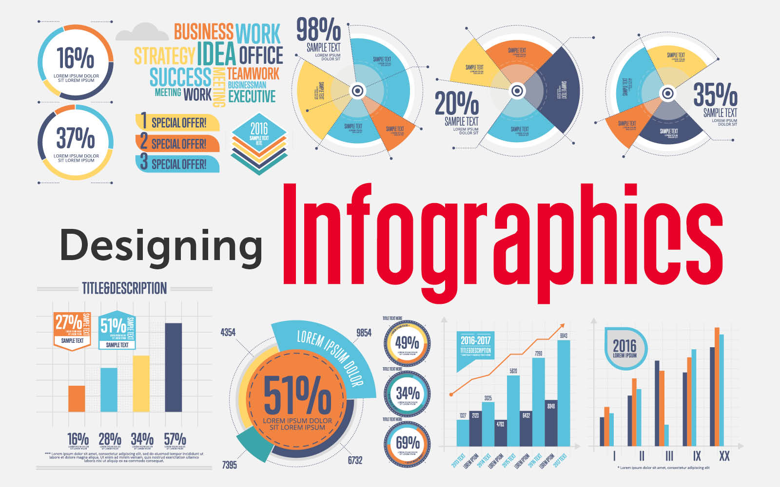
In our previous infographics blog, we discussed the advantages and disadvantages of using infographics in content marketing. In part two we provide our ten top tips to help you design successful infographics.

1. Know your target audience

Idea is only half the battle when it comes to creating a killer infographic. If you don’t know your target audience, your infographic is likely to be more ordinary than extraordinary. And that’s the last thing you want. The infographics with the most footing, most consideration, and most vitality are ones that meet your intended interest group right where they need it most.

Don’t make the mistake of creating an infographic that is generically attractive, rather than uniquely relevant to your target audience. The infographic has an intended appeal to your audience, so keep it precise, relevant, and targeted.

2. Keep it simple

One of the key advantages of infographics is that they can distill advanced ideas into a simple visual form. But at the same time, the inherent power of infographics can also be their demise. An infographic can become needlessly complicated, creating a mind-numbing cognitive overload rather than an “Oh, I get it” experience. Like everything else in life, infographics are better when they are simple. This infographic would work better as four or five infographics. Simplicity wins every time.

3. Keep it focused

Do not make your infographic a blend of statistical data points. Instead, make it streamlined and concentrated on separate topics. Infographics are not endeavors to randomly amass every single bit of information you can gather. Rather, an infographic should be used to drive a single, centered point.

4. Show things visually

Infographics should be short on the “realistic” and long on the “data.” The best infographics are ones that have a precise sense of balance of visual information with written information. This infographic uses a few icons and an image, but not a whole lot of other visual elements. To qualify for the graphic in infographic, it needs more visual elements.

5. Promote it

Infographics do not automatically go viral. You have to put in the time and effort to promote it. Even the most brilliant infographics don’t become popular over night. So yes, your infographic will require a lot of promotion. This can be done in the same way that you’d develop any other valuable piece of content.

6. Make it easy to view

Now and then, an infographic becomes mixed up in its resizing. The designer makes it colossal; at that point, the developer needs to cut it down. All the while, the clarity gets lost. Many infographics have an assortment of text dimensions. Ensure that the smallest text size on your infographic can be seen without much trouble. An infographic should be easy to read and view; 600 pixels wide is a good width to aim for.

7. Make it a convenient length and size

Infographics are supposed to be big. We get that. But go too big, and you’ll start losing people. A limit length of 8,000 pixels is recommended. Alongside a length, file size of an infographic must also be considered. Many users are on a moderate connection, so always try to keep your infographic to approximately 1.5 MB.

8.  Add white space

An infographic is an exercise in graphic design best practice. Which means it is important to add white space around each individual graphic, to give it some breathing space. Your reader will thank you.

9. Create a killer headline

Your infographic’s headline is hugely significant. This rule is the same as with any blog article. The infographic does not get any consideration if it does not have a good headline. So what makes a good headline? Good headlines will have these features:

  • they describe the infographic.
  • they capture the user’s attention.
  • they are short enough to understand at a glance; 70 characters is a good length.

10. Check your facts and figures

Infographics concentrate on displaying information. It’s a quick thought. Our brains can process details and rates way better when we see them, ensure that you’re precise by concentrating on these three often overlooked points.

  • Make sure the information is real.
  • Make sure that your sources are dependable.
  • Make sure that your graphical illustration of the data lines up with the number (if you have both).

Conclusion

The wide-spread use of infographics is a relatively recent phenomenon. But the use of infographics to convey information is extremely popular. Infographics can offer you an unprecedented amount of ways for your business to stay ahead of the competition.

In terms of content marketing for your business, it’s worth looking into infographics. Especially if you have a blog or social media channels, because an attractive infographic makes for highly shareable content. But infographics might not be the most cost-effective type of content for your business. So make sure you understand the pitfalls before shelling out hundreds of dollars with high expectations.

If you would like to know more about infographics and how they could benefit your business, please do not hesitate to get in touch.
Filed Under: Blog, Graphic design, Web design Tagged With: design, graphic, infographic, infographics, information, web

Introduction to infographics

30 October 2017 by tadgraphics

Infographics

Information graphics or infographics as they are more commonly known, are widely used in visual content marketing. More and more businesses are utilising infographics as an efficient way to communicate their composite message in a way that is both easy to comprehend and visually pleasing.

The internet has taken visual marketing to the next level, and infographics are becoming a significant part of that growth. In fact, it is estimated 84 per cent of communications will be visual by 2018, and 79 per cent of internet traffic will be video content by 2018.

So yes, infographics certainly have an important role to play in visual marketing. According to the Content Marketing Institute, the use of infographics has risen from 50 per cent in 2015 to 58 per cent in 2016. And their popularity shows no sign of slowing down.

What is an infographic?

Infographics include a combination of information and graphics featuring charts, diagrams, photos and stylised text. An effective way of creating a story in a more entertaining and eye-appealing manner, visual content marketing has been proven to be many times more effective than text.

This representation of information in a graphic format is designed to make the data easily understandable at a glance. People use infographics to communicate a message quickly, to simplify the presentation of large amounts of data, to see data patterns and relationships; and to monitor changes in variables over time.

According to Usability expert Jakob Nielsen, the regular user knows at most 20 to 28 per cent of words during an average visit. An average person also gets distracted in eight seconds, though a mere 2.8 seconds is enough to distract some people. If you want your message to be seen and understood, infographics are a highly useful tool.

Advantages of infographics

Provides essential facts and figures

People love reading facts, numbers, statistics and other such data. Infographics can help provide this information in a prearranged appealing way. Infographics are much more eye-catching than text. By using infographics to increase interest, it will give your site or blog a lot more drawing power.

Easier to comprehend

. Infographics are visually appealing. Used correctly, they are much easier to understand than text data. The human brain can process and commit to visual memory information better than text.

Social media

Infographics are also on the rise in social media. By combining the influence of infographics and social media, who knows how far your business could go. Social media is a fast-paced platform and when used appropriately will help your business to progress and be noticed. With infographics, all of the information is right there. There is no clicking to get here or there, nothing to sign up for or add time to your readers’ visit.

Simplify the subject matter

Reading lengthy text to understand the data is a very composite and unsightly task. Infographics can present the same issue in a more orderly and simplified way, thus making it incredibly easy for your readers to read and understand the given information.

Disadvantages of infographics

Time consuming

Excellent infographics are not easy to make and call for a decent time investment. Infographics must be thoroughly researched and outlined, cautiously and efficiently designed, and well promoted.

Not naturally SEO friendly

One of the biggest disadvantages of using infographics is that they are not seen as substantial content for search engines; they are not search engine friendly. SEO, particularly localised SEO, is very important for most small businesses to drive real organic customers. A workaround is to post the infographic details in text form, underneath the infographic, and adjust it for keywords.

Require a flexible budget

Many small businesses just do not have a flexible budget to test an infographic drive. The creation of infographics requires many hours or days, and outsourcing the design work to creative professionals can be costly. As a small business entrepreneur, you want to be sure every dollar you invest is going to have a positive return on investment (ROI).

Possible futility

Investing hundreds of dollars into an attractive infographic does not imply viral popularity. There is still a possibility that no one will take notice. This is because creating an infographic is only half the battle. The other half is promoting it. If you still have not considered these steps, your professionally designed infographic could very well fade away into the internet abyss. Also, factors such as timeliness and insignificance can weigh down your campaign.

If you’re looking for a web and graphic designer in Perth, and you would like an informal, obligation free chat about your infographic options, please feel free to get in touch with us.

Filed Under: Blog, Graphic design, Web design Tagged With: benefits, blog, design, graphic, infographic, infographics, trends, web, website

Colours and accessibility in web and graphic design

30 April 2017 by tadgraphics

Colours and accessibility in web and graphic design

Colour is a vital feature in web and graphic design. It helps to enhance a website’s aesthetic appeal and convey information. But even more importantly, colour plays a key role in the usability and accessibility of a website. Colour can increase accessibility but when used incorrectly, it can create unnecessary difficulties.

Older people, and those with only partial sight or colour blindness often face difficulties accessing important information, simply because the design of the site or the graphics are not optimised for accessibility.

It is good practice to anticipate the requirements of diverse groups of users. A visual design that accommodates the broadest audience possible is always the best practice in web and graphic design.

The challenge

Designing for those with partial sight or colour deficits, particularly colour blindness, can be challenging. It’s not easy to determine what colours these users can see and how that’s different from people with normal vision.

Colour blind people generally find it hard to distinguish certain colour combinations, which may vary depending on their type of colour blindness. In other words, there are different types of colour blindness and the difference between them is what makes coming up with accessible designs all the more difficult and complex.

Prioritising the design is a good strategy I find works most of the time. The content, and how best to present it, should be the main focus of any design in these circumstances.

When it comes to web page design, fonts, typefaces and colours can actually make some content difficult to read. Therefore, optimising text (font) and colours is the best way to make your design colour-blind safe and friendlier to almost everyone.

Optimising text (font) and colours is the best way to make your design colour-blind safe and friendlier to almost everyone

So, what works best?

Colours and fonts with distinct contrast offer better readability. Therefore, they work best for people with colour blindness and vision deficiency.

It’s important to note that it is the contrast between colours that makes them either more or less discernible and not actually the individual colours themselves. By contrast here I mean the difference between the darkest colour (foreground e.g. text) and the lightest colour (background).

Colour blind people are less sensitive to colours that fall on either side of the spectrum. For instance, red and blue may appear darker to a colour blind user. Such a deficit can be compensated by increasing the contrast between the foreground (text) and background colours.

In other words, if you lighten the background colours and darken the foreground colours in your design, you will make the contrast between them greater, which in turn increases its visual accessibility.

For example, bright and vibrant colours like orange, yellow or white are suitable for the background, and a darker colour such as blue or black for the text.

There is no single best combination to work with and this is mainly due to the different sight conditions. While some users are comfortable with yellow text on a black or blue background, others may prefer black text with a white background.

The Web Content Accessibility Guidelines 2.0 offers a contrast ratio guideline that designers can utilise to ensure accessibility of their website content. The recommended contrast ratio between text and its background is at least 4.5:1. For large text, that is, 24px or 29px bold, this ratio should drop to 3:1.

What about font?

The choice of font is another very significant issue when it comes to web and graphic design accessibility.

A large percentage of users, especially those whose sight is less strong, have trouble reading small fonts, particularly below 14 points. While for some the barrier lies in the low contrast between text and background.

So, what’s the best approach as far as font and font size is concerned?

Light text (white or light yellow) on a dark background (e.g. black) may be more readable for older users or those who are partially sighted than the traditional dark text on a light background.

This might sound contradicting with my earlier recommendation on colour contrasting, but it’s not. The idea is still the same. That is, to attain the highest possible contrast between text and background colours.

For font size, one thing to keep in mind is that the logical resolution between platforms somewhat differ. Nonetheless, it is recommended to use larger font sizes, preferably at least 16 to 18 points.

The same applies to spacing between lines of text. The majority of partially sighted users have difficulty locating where the next line of text begins while reading. So, a good spacing should be around 25 to 30 per cent of the font size.

In addition to line spacing, text that has close letter spacing often presents difficulties for readers with partial sight. So wide monospaced letters might be legible enough for these readers.

Another thing to consider is the font family. Here, it’s ideal to employ only clear, commonly used fonts. Fonts like Standard Serif, Arial or Sans-Serif are the best, since they are quite legible and easier to read than a font like Times New Roman for instance.

Again, there is no best font type or size, it’s just a matter of striking a good balance that will give all users the best possible experience. One thing to avoid though is using absolute font sizes on your design.

Why bother?

You might wonder why web and graphic designs should be optimised for accessibility for such a small population. Well, those with normal vision are not the only online users. Colour blind, partially sighted and older people could make up to 2 in 20 online visitors.

For a regular site, that extra traffic from this group of users might not be that significant, but for an accessible well-designed website, they are worth considering as another good source of visibility.

And there are other benefits than just an increase in traffic too.

A good accessibility design when done well will also help with search engines rankings. Visually impaired people often use screen readers to read content on web sites. These screen readers function in the same manner as text browsers and most search engines rely on text browsers to review how friendly a site is to all users.

By designing an accessible web site, you make it search engine friendly and easier for search engine robots to crawl, which should lead to higher rankings and that’s an added benefit.

A good accessibility design when done well  will also help with search engines rankings

Building a site that’s accessible by everyone is also good practice and both designers as well as developers have a responsibility to ensure that their web and graphic designs take into account all users who wish to view their content.

On top of that, there are standards and guidelines that keeps sites accountable. One of the most crucial web compliance as far as accessibility is concerned is the Web Content Accessibility Guidelines 2.0. It defines a set of accepted international guidelines that web designers and developers should follow to make web content accessible to users with disabilities.

The WCAG has three priority levels in which compliance with the recommendations specified in each level guarantees greater accessibility of web sites. In addition to the three priority levels, there are three levels of conformance that a site must abide to for it to be considered accessible.

All in all, designing inclusively for the widest audience is much more rewarding and should not be taken lightly. It’s important that web and graphic designers realise that you don’t need to compromise the look and feel of a website in order for it to be accessible.

Call + 61 402 636 014 to find out more about our web and graphic design services. You can also get in touch via our contact page, or by sending an email to tadgraphics@t-adstudio.com

Filed Under: Blog, Web design Tagged With: accessibility, contrast, design, graphic design, web, web design

Responsive web design: what is it and why you need it

31 March 2016 by tadgraphics

Responsive web design: what is it and why you need it

We love websites. Which is a good job because we work with them every day, designing and maintaining corporate and personal blog type sites, brochure websites and ecommerce online shopping cart stores. While no two websites are ever the same, they share a commonality – the same responsive design.

You see it’s all well and good having an online presence, but if it’s not responsive in design, you’re doing your business – and your customers – a great injustice. And potentially affecting your traffic and search engine rankings too.

Google, the biggest search engine in the world, loves responsive websites. And so should you. In just a few short years they’ve transitioned from an option and a bit of a luxury into a necessity. Responsive websites rock.

Fair enough. But what is a responsive website?

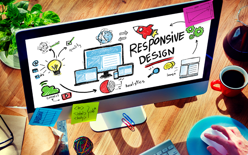
That’s a good question. You know how sometimes you use your smartphone to view the internet, and other times you might use your desktop and even a tablet? Well having a responsive website design really just means your website can be viewed across different devices.

Think of it as a one-size-fits-all. A responsive website provides whoever is viewing it with the same look and feel, regardless of whether they’re accessing it from a desktop or a mobile device, and across the plethora of web browsers (Google Chrome, Internet Explorer, Safari, Firefox, etc.) too.

Long gone are the days where desktop computers and laptops are the only way of accessing the internet. Viewing experience has never been more important. Lay out and coding is key to providing a website which delivers an optimal viewing experience for customers.

With a responsive website navigation, images, text and screen layouts have the ability to re-adjust themselves across a variety of devices. As web designers, it’s our job to ensure that happens by embracing a responsive design. It saves time and money in the long run because it means not having to create and maintain separate desktop and mobile versions of the same website.

Having a responsive website is a little more expensive but it’s the smarter choice. Yes, it takes longer to design, develop and test. But it’s better than having to meet the cost of designing, developing – and not to mention maintaining – two websites. So you’re actually saving yourself money in the long run.

Saving money is great. Any other benefits and advantages?

Plenty.

The benefits of responsive websites continue way beyond the initial design and development. As we touched upon earlier, Google are big, big fans of responsive design. In fact, last April the internet giant announced its intention to start demoting websites which weren’t mobile friendly. That’s a pretty big hint!

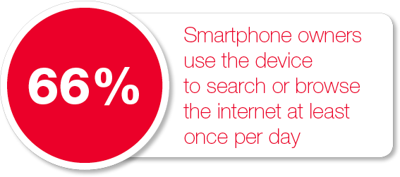
The fact is more and more people are using their tablets and smartphones for online access. According to the 2014 Australian Mobile Phone Lifestyle Index, 66% of smartphone owners use the device to search or browse the internet at least once per day. The change in internet access, from desktop computers to portable devices cannot be overlooked. We live in a smartphone society where digital connectivity is only going to increase.

There’s no two ways about it: a responsive website is a business necessity.

66% of smartphone owners use the device to search or browse the internet at least once per day

Do my customers care about responsive websites?

Yes. And so should you. If your website isn’t optimised for mobiles and tablets, you could potentially lose business. If potential customers can’t navigate their way around your website easily, they will leave and likely go elsewhere. Imagine losing business to a competitor simply because their website is far better optimised for mobile users? Doesn’t sound good for business, does it?

A website which is responsive in design not only looks the business but it loads faster too. And it’s better for SEO – a way of improving your search engine rankings to help customers find you. At the end of the day, it’s all about giving the customer the best experience possible.

Before we finish, let’s go back to those earlier figures: 66% of smartphone owners use the device to search or browse the internet at least once per day.

Like it or not, mobile internet users are growing day by day. It means a chunk of your customers favour their mobile devices for their online activities over traditional desktop and laptop computers.

Still think you don’t need a mobile optimised website?

The good news is, it’s never too late to invest in a responsive website. Come and talk to us about our affordable all-in-one responsive mobile optimised website design services. We can even take care of all your copywriting requirements too.

Simply give us a call on +61 402 636 014, send an email to tadgraphics@t-adstudio.com or message us via the contact form.

Like what you read? You can follow us on Twitter @tad_graphics.

Filed Under: Blog, Web design Tagged With: design, responsive, web, website

Nine reasons why you need a website

25 February 2016 by tadgraphics

9 reasons why you need a website

Most businesses today realise the value of having a professional, responsive and easy to navigate website. Whether you’re a sole trader, a small business, a franchise or not-for-profit organisation, in today’s world having some kind of online presence is vital to your success.

If you’ve been thinking about having your own website, but have so far resisted the urge to take the plunge, we’ve put together a few good reasons why you should take the leap and get your business online. With over two billion people using the internet everyday, if you don’t have a website you’re actually missing out on a highly powerful sales and marketing tool. Not only that, but it’s affordable too.

Okay, so having a website might sound scary, daunting or difficult. But it really isn’t. And better still, a website is one of the easiest ways to get your name out there – without having to spend a fortune on marketing.

So let’s take a look at a few reasons why a website makes great sense for you and your business.

Num_01It’s an affordable way to market your business

Affordable. One of our favourite words. We don’t believe a small business should have to spend a small fortune to get their website up and running. There are of course online services that provide templates for free website. But we’re big believers in that old saying: you get what you pay for. If you’re looking to create a professional, credible online presence, do you really think a free website is going to pass muster? No, neither do we. A professionally designed responsive website with engaging, well written search engine friendly content doesn’t have to cost the earth.

Num_02Think of a website as an online brochure

As much as we love the feel and smell of 300 gsm paper, printing has become ridiculously expensive. Rather than creating business cards, brochures and flyers, which you’re probably going to have to distribute yourself, once your website is up and running, you’ll have this wonderful piece of digital real estate to direct clients and customers to. Oh, and it’s better for the environment.

Num_03Websites are great for brand building

A brand will help you win over new customers – and retain them. A website is an extension of your brand. It’s an important part of your business’s brand identity and the most visible face of your brand. Remember first impressions count. A well designed user friendly website will appeal to potential new customers and give you the opportunity to create the best first impression for your business. We only get so many opportunities to impress.

Num_04Always open for business

Websites don’t have lunch breaks or holidays. They rarely get ill. They don’t have set opening hours, and unlike an office or business premises, you won’t have to be on site and it doesn’t need locking up at the end of the working day either. Think of a website as 24/7 advertising. It will work hard for you every hour of the day and every day of the year.

Num_05It’s instant credibility for your business

These days you don’t need a shop or an office to promote and sell goods and services. A website can do all that for you. So bye bye expensive overheads. Remember how we said over two billion people use the internet daily? It’s a fact that more people than ever before are turning to the internet to buy products and look for services. Why? Because it’s much easier and faster and more convenient. If you haven’t got a good website, just think of all the potential customers you could be losing to your competitors?

Num_06Attract more customers and clients

Whether you’re selling a product or a service, to make any sort of sale you first need customers. To get customers, you need to promote yourself. A professionally designed website is a great promotional platform. As a medium on which to showcase your work and what you do, here you have the perfect opportunity to outshine your competition. Testimonials, an online portfolio or gallery of work can all help you to stand out from the crowd.

Num_07Websites create measurable results

You will be able to check the number of visitors to your website and, in the case of an ecommerce website, record the number of online sales. It’s important to measure website traffic and where your visitors are coming from. Once you’ve armed yourself with this valuable information, it will help you to improve your website and visitor experience.

Num_08Websites can save you money

We like saving money as much as we like making it – and spending it! Websites as a form of advertising are much, much cheaper than radio and television advertising. Placing an advert in a newspaper or magazine will cost you more without nowhere near the same kind of reach. Factor in the cost and the potential exposure, websites are the most cost-effective way to promote your business.

Num_09Your competition most likely has one

Generally, we don’t believe in following the crowd. Just because that’s what everyone else is doing, doesn’t mean you have to. But websites are a good exception to that rule. It’s a bit of a dog eat dog world out there. If your competitor has a website and you don’t, you’re the one losing out. Sorry, but it’s true. Smart businesses recognise the value websites can bring to the table.

At TAD Graphics, we offer a range of affordable web and graphic design services. We design great looking websites that are responsive, customer friendly (easy to navigate!) and more over, affordable websites to give you a voice in the online world.

Whether you’re an individual, a small business or a medium sized company, we’d love to help you with your website project. What have you got to lose? Drop us a line and we’ll happily provide you with a free quote. If you want to meet up too, that’s great. We love informal chats over coffee and cake. We’re also quite partial to biscuits too. But never both. We’re not that greedy!

Filed Under: Blog, Web design Tagged With: design, development, web, website

© Copyright 2005-26. All rights reserved. t ad studio | tad graphics. Web and graphic design Perth. Admin